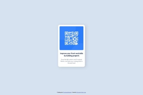
Submitted 4 months agoA solution to the QR code component challenge
Responsive Design using Css flex and media query

@vectorleo
Code
Please log in to post a comment
Log in with GitHubCommunity feedback
- @shandy100-cyber
Thats a incredible code, I love it, but I would use container queries to replace the @media query, thats a very minimal detail, cause @media is used in cases where the main container (in this case ".wrapper") needs to be modified too, which doesnt need to be manipulated (this is from what I can understand at my low level of experience and its just a subjective opinion of mine). Anyway thats a very accurate version Congrats!
Marked as helpful

Join our Discord community
Join thousands of Frontend Mentor community members taking the challenges, sharing resources, helping each other, and chatting about all things front-end!
Join our Discord