Responsive design using flexbox.

Solution retrospective
I am just proud that I was able to complete it.
What challenges did you encounter, and how did you overcome them?Since it was first challenge on this roadmap, it was farely a simple challenge . I didn't came across any major challenge. It was first time to work with figma design that was some what challenging.
What specific areas of your project would you like help with?None. I was able complete it by myself.
Please log in to post a comment
Log in with GitHubCommunity feedback
- @Alejo2304
Does the solution include semantic HTML?
The code is clear and includes sematic HTML, for example:
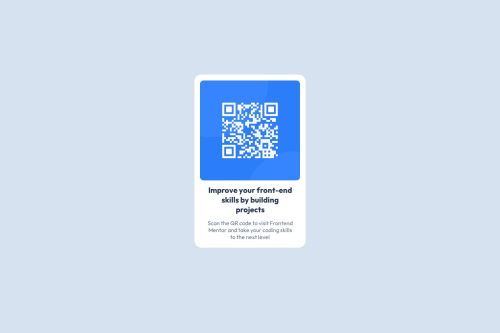
<main>
    <div className="container">
      <img src="/image-qr-code.png" alt="qr-image" />
      <h1>Improve your front-end skills by building projects</h1>
      <p>Scan the QR code to visit Frontend Mentor and take your coding skills to the next level</p>
    </div>
</main>
The <main>, <img>, <h1>, <p> are really descriptive for the solution.
Is it accessible, and what improvements could be made?
Yes it is, and the live site works fine for both mobile and Desktop
Does the layout look good on a range of screen sizes?
Surely it does.
Is the code well-structured, readable, and reusable?
The use of React for the project make it really readable and easy to divide into components.
Does the solution differ considerably from the design?
No, there is really small difference on the style for the style <h1> <p> tags.
For the <p> the font size looks a little bigger on the solution, and on the <h1> you may see on the solution the text is arrange on 3 rows, thought this doesn't really affect the overall experience.
Nice fist project!.

Join our Discord community
Join thousands of Frontend Mentor community members taking the challenges, sharing resources, helping each other, and chatting about all things front-end!
Join our Discord