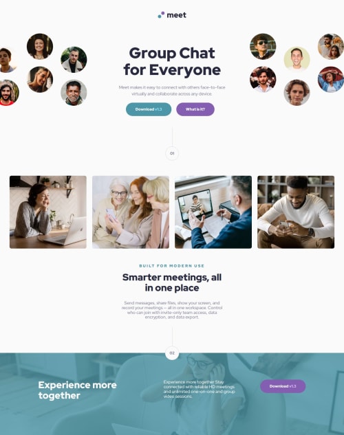
Responsive design, using sass, css and html

Solution retrospective
I liked the little section dividers between sections. Thought it would be a challenge, to create them, but ultimately, I had them quickly.
The next challenges I'll use less media queries and make the designs more fluid using clamp functions.
What challenges did you encounter, and how did you overcome them?The most difficult challenge for me was the hero from mobile/tablet to desktop. I have the feeling I used a hack that is not very nice, but does the job (negative margin on the center text to get it up).
What specific areas of your project would you like help with?I was playing with the idea of order to change the order of the items in the hero section of the desktop. However, I couldn't make it work. I am excited to hear the 'best' solution from someone. I am not too happy with the solution I came up with.
Please log in to post a comment
Log in with GitHubCommunity feedback
No feedback yet. Be the first to give feedback on Erwin's solution.
Join our Discord community
Join thousands of Frontend Mentor community members taking the challenges, sharing resources, helping each other, and chatting about all things front-end!
Join our Discord