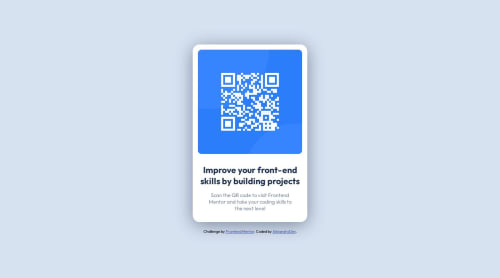
Responsive design with grid and flexbox

Solution retrospective
I did this challenge again putting in practice the concepts in the last feedback, i've been studying so hard lastly so i'm here to give all of me.
I made this little challenge using pure css and applying my best practices.
I would love to receive more feedback to keep improving my skills and learn from you guys!
greeting! 😃🚀
Please log in to post a comment
Log in with GitHubCommunity feedback
- @gfunk77
Well done Alejandro. Your solution looks just like the picture so it is totally excellent.
I would suggest experimenting with something like this:
<main class="container"> <div class="wrapper"> <img src="./images/image-qr-code.png" alt="QR code" /> <h1>Improve your front-end skills by building projects</h1> <p> Scan the QR code to visit Frontend Mentor and take your coding skills to the next level </p> </div> </main>All I did above was put the img, h1, and p inside the wrapper. From here, you could just put a padding all the way around on the .container. Put border: 2px solid color on the boxes so you can see what is happening and what is taking up space. Then I'll think you'll find that you wont need to put widths on the h1 and p. You won't even need the flexbox on the container. This might help streamline your css.
I hope this is helpful feedback. Great work!!
Marked as helpful - @jewlias
Great work Alejandro on completing the QR code challenge


Join our Discord community
Join thousands of Frontend Mentor community members taking the challenges, sharing resources, helping each other, and chatting about all things front-end!
Join our Discord