Responsive div with image and text

Please log in to post a comment
Log in with GitHubCommunity feedback
- P@Islandstone89
HTML:
-
Every webpage needs a
<main>that wraps all of the content, except for<header>andfooter>. This is vital for accessibility, as it helps screen readers identify the "main" section of a page. Wrap.squarein a<main>. -
Always give images an
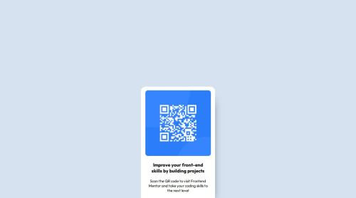
altattribute. If the image is decorative, the alt text should be empty:alt="". However, this image has meaning, so it must have proper alt text. Write something short and descriptive, without including words like "image" or "photo". Screen readers start announcing images with "image", so an alt text of "image of qr code" would be read like this: "image, image of qr code". The alt text must also say where it leads(frontendmentor.io). -
Headings should always be in order, so you never start with a
<h3>. Change it into a<h1>. -
Do not use
<br>to force text onto a new line. The text should flow naturally, and all styling, including space between elements, should be done in the CSS. -
Remove the
<button>, it cannot be inside a link. It's OK to style the link like a button, though.
CSS:
-
Including a CSS Reset at the top is good practice.
-
Remove
font-optical-sizingandfont-style, they are not needed. -
Add around
1remofpaddingon thebody, so the card doesn't touch the edges on small screens. -
Remove
display: blockon the card - a<div>IS a block element, so there is no need to declare it explicitly. -
Remove the margin on the card.
-
To center the card horizontally and vertically, use Flexbox on the body:
display: flex; flex-direction: column; justify-content: center; align-items: center; min-height: 100svh;-
Remove all widths and heights in
px. -
Add a
max-widthof around20remon the card, to prevent it from getting too wide on larger screens. -
font-sizemust never be in px. This is a big accessibility issue, as it prevents the font size from scaling with the user's default setting in the browser. Use rem instead. -
Since all of the text should be centered, you only need to set
text-align: centeron the body, and remove it elsewhere. The children will inherit the value. -
Paragraphs have a default value of
font-weight: 400, so there is no need to declare it. -
Remove the margin on the image. Add
display: blockandmax-width: 100%- the max-width prevents it from overflowing its container. -
To create the space between the image and the edge of the card, set
paddingon all 4 sides of the card:padding: 1rem;.
-

Join our Discord community
Join thousands of Frontend Mentor community members taking the challenges, sharing resources, helping each other, and chatting about all things front-end!
Join our Discord