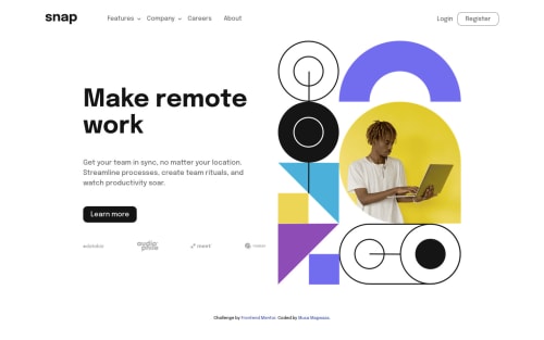
Responsive Dropdown Navigation

Solution retrospective
This was challenging 😅
the nav was not easy to implement but I decided to use flexbox, I wonder if maybe using grid would have been easier or the way I went about it that made it complicated.
I would love feedback on the dropdown functionality, how can I improve it.
The hero section I'm wondering how I can make the image height equal to the description height.
I feel the layout used to many breakpoints, I would love some input on how I can less breakpoints.
Please log in to post a comment
Log in with GitHubCommunity feedback
- @aweliego
Hi! I was looking for more solutions on this challenge and came across yours.
I personally like using flexbox for elements like a navbar as I find it more suitable than grid for small components (flexbox being content-first based while grid is layout-first based), but in principle you can use whichever you like to achieve the same thing. I think you did well with flexbox!
It's been a minute since I wrote vanilla JS but I don't think you can do much shorter/better for the dropdown functionality (and the other functionalities for that matter). Your JS does exactly what it's supposed to do and is concise. I like that it's simple and easy to understand!
Regarding the height of the image and description, I assume what you want to do is having the bottom of the description (the client images) aligned with the bottom of the image. If that's what you meant, you can achieve this with
align-tems: end;on theherocontainer:.hero { margin-bottom: 3rem; @include breakpoint-up(xlarge) { display: grid; grid-template-columns: 1fr 1fr; grid-auto-rows: auto; gap: 2rem; width: 90%; max-width: 1000px; margin-right: auto; margin-left: auto; align-items: end; ------> add this } &__image { margin-bottom: 2rem; ------> remove this order: 1; } &__description { padding-right: 1rem; padding-left: 1rem; text-align: center; @include breakpoint-up(medium) { padding-right: 3rem; padding-left: 3rem; } @include breakpoint-up(xlarge) { text-align: left; align-self: center; ------> remove this padding: 0; } }Or just replace
align-self: center;withalign-self: end;but I think it's nicer to have the property on the parent element. Then you just need to play with the margin/padding of the text elements inside the description to make it look better.Regarding the breakpoints, I usually go for just two or three views of the site, so mobile/desktop or mobile/tablet/desktop (depending on the project). I agree that it's a bit overkill otherwise to have so many, and most sites will render well also with fewer breakpoints.
Overall I think you did a good job on this challenge, your code is very clean and easily readable, and the responsiveness is top notch! Keep it up!
EDIT: something I forgot to mention - I find it a bit unhandy that the drop-downs in the navbar open on hover but that you need to click the button to keep them open, and that to close them you need to click again exactly on the button (instead of just anywhere). So I think there could be some improvements here as well. Also, the arrow icons (both in the navbar and sidebar) are not pointing to different directions when you open/close the drop-downs, as shown on the designs.
Marked as helpful

Join our Discord community
Join thousands of Frontend Mentor community members taking the challenges, sharing resources, helping each other, and chatting about all things front-end!
Join our Discord