Skip to content
  • Unlock Pro
  • Log in with GitHub
Solution
Submitted about 3 years ago

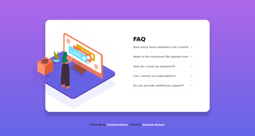
Responsive Faq accordion secion made with CSS grid and CSS flexbox

sass/scss
Kamasah-Dickson•5,570
@Kamasah-Dickson
A solution to the FAQ accordion card challenge
View live sitePreview (opens in new tab)View codeCode (opens in new tab)

Solution retrospective


Hello Frontendmentors. I am back with a new design that I tried my hands on. I am currently Learning JavaScript so I tried myJavaScript skills on this design and it was successful . I also added a CSS animation to the dropdown any suggestion about that also?

#1. I found it difficult positioning Images as to how the design looks. Working with Images Is complicated.

#2.I am unsure about the media breakpoints between mobile and desktop which is the Tablet. Please anybody? what do you think about the breakpoints. or what do you suggest.

#3. Is it a best practice to set a min-height for a flex or grid container?

Code
Select a file

Please log in to post a comment

Log in with GitHub

Community feedback

  • Raymart Pamplona•16,040
    @pikapikamart
    Posted about 3 years ago

    Hey, nice work on this one. For desktop layout, I think it looks fine, just needed for the proper font-weight to be used and also the svg's outline is overflowing, on the original, the outline should be cut. The mobile state looks fine as well.

    On your questions:

    1. Yep, working with images sometimes is hard specially when you need to position: absolute something but I think that you did great on this one!
    2. For the breakpoints, it depends sometimes on the design of the project that you are creating, sometimes it doesn't need to use breakpoints especially when you created the component really responsive. For me, when I use breakpoint, I typically go with 768px for the tablet and 1000px on desktop state, I always start now with mobile first approach. Sometimes this changes because like I said, it depends on the layout.
    3. You can if you want and there's nothing wrong with that. I use that when there is only a single component of the page and I want the whole body to occupy the full height.

    Here are some other suggestions for the site:

    • When including images on your site that acts only as decorative images, you should always use an empty value for the alt attribute and adding an extra aria-hidden="true" attribute on the img would be nice. On this one, the lady illustration should be using those attributes I mentioned since it is only decorative.
    • Just a remined, only use descriptive alt values for images that are really meaningful on the site and when adding the text, the text should not include words that relates to graphic such as illustration, image, icon since the img tag is already a graphic and no need to describe it as one.
    • Change those FAQ question from using h2 into using button or maybe just use a details element on this one. When creating applications or websites, if a component is interactive, always use interactive elements like button. I saw that you are using the div as a toggle for the content which should not be the case.
    • Those arrow-images should be hidden as well since it is only a decorative image. Use the above method I mentioned to hide it.
    • For each question's answer, those are only being hidden visually by the overflow and max-height but a user can still traverse those. If you need to hide an element, adding the visibility: hidden should be done and visibility: visible if it needs to be shown.

    Aside from those, great job again on this one. Let me know if you need any help.

Join our Discord community

Join thousands of Frontend Mentor community members taking the challenges, sharing resources, helping each other, and chatting about all things front-end!

Join our Discord
Frontend Mentor logo

Stay up to datewith new challenges, featured solutions, selected articles, and our latest news

Frontend Mentor

  • Unlock Pro
  • Contact us
  • FAQs
  • Become a partner

Explore

  • Learning paths
  • Challenges
  • Solutions
  • Articles

Community

  • Discord
  • Guidelines

For companies

  • Hire developers
  • Train developers
© Frontend Mentor 2019 - 2025
  • Terms
  • Cookie Policy
  • Privacy Policy
  • License

Oops! 😬

You need to be logged in before you can do that.

Log in with GitHub

Oops! 😬

You need to be logged in before you can do that.

Log in with GitHub

How does the accessibility report work?

When a solution is submitted, we use axe-core to run an automated audit of your code.

This picks out common accessibility issues like not using semantic HTML and not having proper heading hierarchies, among others.

This automated audit is fairly surface level, so we encourage to you review the project and code in more detail with accessibility best practices in mind.

How does the CSS report work?

When a solution is submitted, we use stylelint to run an automated check on the CSS code.

We've added some of our own linting rules based on recommended best practices. These rules are prefixed with frontend-mentor/ which you'll see at the top of each issue in the report.

The report will audit 1st-party linked stylesheets, and styles within <style> tags.

How does the HTML validation report work?

When a solution is submitted, we use html-validate to run an automated check on the HTML code.

The report picks out common HTML issues such as not using headings within section elements and incorrect nesting of elements, among others.

Note that the report can pick up “invalid” attributes, which some frameworks automatically add to the HTML. These attributes are crucial for how the frameworks function, although they’re technically not valid HTML. As such, some projects can show up with many HTML validation errors, which are benign and are a necessary part of the framework.

Oops! 😬

You need to be logged in before you can do that.

Log in with GitHub