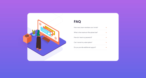
Not Found
Not Found
Not Found
Not Found
Not Found
Not Found
Not Found
Not Found
Not Found
Not Found
Not Found
Not Found
Not Found
Not Found
Not Found
Not Found
Not Found
Not Found
Not Found
Not Found

Submitted

Responsive FAQ section / BEM / mobile-first

Rapha445 100

@Rapha445

Desktop design screenshot for the FAQ accordion card coding challenge

This is a solution for...

  • HTML
  • CSS
  • JS
1newbie
View challenge

Design comparison


SolutionDesign

Solution retrospective


Hi everyone! This was my first time using javascript. I had a hard time getting the images to stick where I wanted them to be when changing the screen size. I finally got it right but don't really understand how I got that result after struggling a lot 😅 Would love to hear any advice!

Cheers,

Community feedback

Rio Cantre 9,710

@RioCantre

Posted

Hello there! Great work with this one. Regarding the solution you submitted, I think you should also take notes of the following…

  • Import the attribution style in CSS file and remove the style tag
  • Add background: linear-gradient(#af67e9, #6565e7); in the body rule set
  • Another way is to wrap this part with footer tag or place it inside the main tag
  <div class="attribution">
    Challenge by <a href="https://www.frontendmentor.io?ref=challenge" target="_blank">Frontend Mentor</a>.
    Coded by <a href="#">Your Name Here</a>.
  </div>
  • This line <div class="background__faq faq"> could be wrap with section tag
  • Include description with the alt in image tags. Like this line <img class="image__woman" src="images/illustration-woman-online-mobile.svg" alt="">

Above all, The design looks good. Keep it up!

0

Please log in to post a comment

Log in with GitHub
Discord logo

Join our Discord community

Join thousands of Frontend Mentor community members taking the challenges, sharing resources, helping each other, and chatting about all things front-end!

Join our Discord