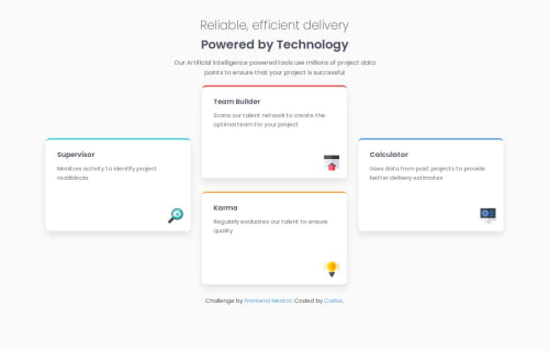
Responsive feature grid using CSS Grid and Flexbox

Solution retrospective
I'm proud of how the layout adapts smoothly across different screen sizes while closely following the original design. I also took care to apply good accessibility practices and use semantic HTML.
If I were to do this project again, I'd consider organizing the CSS using a preprocessor like SASS or a methodology like ITCSS to make the codebase more scalable and maintainable.
What challenges did you encounter, and how did you overcome them?The most challenging part was arranging the cards into the asymmetric desktop grid layout, especially placing the two stacked middle cards ("Team Builder" and "Karma").
I tackled this by using grid-template-areas for precise control over layout and align-self to vertically center the side cards.
What specific areas of your project would you like help with?I would appreciate suggestions on:
-
How to improve CSS scalability for larger projects
-
Best practices for organizing files and separating responsibilities (e.g., components)
-
Modern alternatives like Tailwind CSS or utility frameworks, and when it's worth using them
Please log in to post a comment
Log in with GitHubCommunity feedback
- P@dar-ju
Hi Carlos Alberto da Silva!
You have a great job! The only thing I would do in the section is wrap the cards in the <ul> tag and each card in <li>. After all, this is a list\set of cards, it is semantically correct to use the appropriate tags.
I will try to answer your questions.
- "How to improve CSS scalability for larger projects" You can study the BEM methodology. It allows you to move\copy blocks\components within the project without adjusting styles. You should also look at SCSS, with this tool you get a more readable CSS code structure in the form of a tree. The combination of BEM and SCSS provides an excellent opportunity for scaling.
- "Best practices for organizing files and separating responsibilities (e.g., components)" Here you should clarify what tools you will work with. For example, if you work with React, they have a recommended structure on their website. In the context of your project, the structure is correct.
- "Modern alternatives like Tailwind CSS or utility frameworks, and when it's worth using them" - all these frameworks are created to speed up and simplify working with styles. Whether to use them depends on your preferences. If you master Tailwind, the speed of styling will be higher and easier. The downsides are that it is more difficult to perfectly match the layout to the design layout, as well as long and hard-to-read class code.
Marked as helpful

Join our Discord community
Join thousands of Frontend Mentor community members taking the challenges, sharing resources, helping each other, and chatting about all things front-end!
Join our Discord