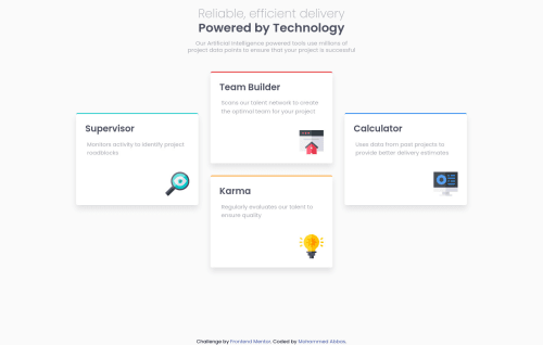
Submitted about 3 years agoA solution to the Four card feature section challenge
Responsive feature section using css grid

@Mohammedabbas7
Solution retrospective
The challenge was easy in general but what I found difficult is how to create the layout for a large screen. I used a CSS grid for the layout and I define 12 columns and 12 rows. I just wondering if I did right. Any feedback, please.
Code
Please log in to post a comment
Log in with GitHubCommunity feedback
- @Hatchino
Hi, Why are you used 12 columns and 12 rows, I think 3 columns and 4 rows is enough. You define the grid-template-areas and all is working. You can look at my solution if it can help you. In your code I think it's unintentional but you added a class to your span which is undefined. Whatever, I like hover transition on the footer.
Marked as helpful

Join our Discord community
Join thousands of Frontend Mentor community members taking the challenges, sharing resources, helping each other, and chatting about all things front-end!
Join our Discord