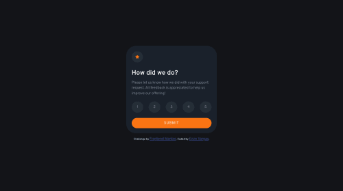
Not Found
Not Found
Not Found
Not Found
Not Found
Not Found
Not Found
Not Found
Not Found
Not Found
Not Found
Not Found
Not Found
Not Found
Not Found
Not Found
Not Found
Not Found
Not Found
Not Found

Submitted

Responsive Flip Card with flex and grid

EVargas 20

@EVPina

Desktop design screenshot for the Interactive rating component coding challenge

This is a solution for...

  • HTML
  • CSS
  • JS
1newbie
View challenge

Design comparison


SolutionDesign

Solution retrospective


Is better to use max-width to min-width in Media-Query?If not, in what case is recommendable to use it?

Community feedback

turtlecrab 550

@turtlecrab

Posted

Using min-width is mobile first approach, it means that you first style your page for the small screen sizes, then add media queries with min-width for tablets, desktops, tvs(it could be 1 or more breakpoints).

On the contrary, max-width is desktop first approach - you first style for the desktop screen size, then add media queries for smaller screens.

I think mobile first is widely considered to be a better practice(google mobile first to read the arguments), but some people say that desktop first is easier and in some cases is more appropriate.

My advice would be to try them both, do a solution here with one of the approaches and the next solution with another, then compare you feelings :)

I personally did one solution here with desktop first, my motivation was to match the final design comparison screenshot as close as possible, and because it's a desktop screenshot I started with designing for that. But mobile first feels smoother to me, it's easier for me to first focus on basic stuff and smaller screen and then build up on that.

0

Please log in to post a comment

Log in with GitHub
Discord logo

Join our Discord community

Join thousands of Frontend Mentor community members taking the challenges, sharing resources, helping each other, and chatting about all things front-end!

Join our Discord