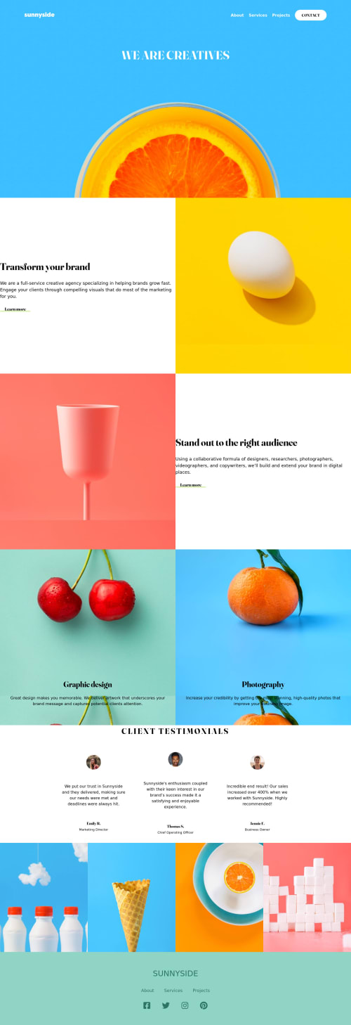
Responsive for two devices using the tailwind component for header.

Solution retrospective
Feel free to provide your opinion about my code and your opinion is what I'm looking for. I found the most difficult part of this challenge is to make the landing page responsive. It took a lot of time to partially finish it. So I appreciate the feedback.
Please log in to post a comment
Log in with GitHubCommunity feedback
- @OkaforRaph
Hey @ Satya, Congratulations on completing the challenge 🎉.
Here are some tips to help you on your next project..
-
First, there are issues with accesibility and HTML issues from your code which should be looked at.
-
Secondly, the arrow on your hero section is not there (From the preview).
-
Also, your code is not linked properly (I think you linked the wrong GitHub repository) so I can see your code to correct you further.
Hope this helps, Happy Coding 😊
Marked as helpful -
- @Prakhar-99
hello @satya-hash here some advise that I think make your sollution quite good 1 add background-repeat = no-repeat and background-position = center, background size = cover in all your background container. 2.when you apply media query change the flex direction of container that contain egg background image . 3 add margin from left, right in content (h1, paragraph and button) of class " left & right". and give some specific width to para of this classes. 4 give specific width to para of classes orange and cherry like 80%-85%.
5.give a margin top and bottom in your testimonial section and give a width of 300 or 320px to your testimonia card and on flex wrap in testimonial card container thanks for read hope this can help you make your solution good
Marked as helpful
Join our Discord community
Join thousands of Frontend Mentor community members taking the challenges, sharing resources, helping each other, and chatting about all things front-end!
Join our Discord