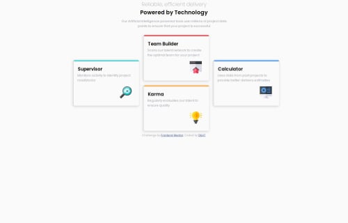
Responsive four card

Solution retrospective
i am glad i managed to pull off the layout and that the page is responsive
What challenges did you encounter, and how did you overcome them?centering text so that it should be as on the design it was a bit tough for me but i use margin:0 auto; it align elements horizontally with equal left and right.and making the desktop design but i used grid-area
What specific areas of your project would you like help with?i managed to use grid-area to align the cards for the desktop design but i would like to know the other way. and also to align the text with the responsive units as in the designs
Please log in to post a comment
Log in with GitHubCommunity feedback
- @alaa-mekibes
Good job, just a few points to fix:
- Update Your README File
Start by using the provided README template included in the starter file. Customize it to enhance clarity and professionalism.
- Use Only One <h1> Per Page
Maintain a proper heading structure, using <h1>, <h2>, and <h3> in a hierarchical manner. This improves both organization and SEO.
- Use css variables to improved maintainability like this:
:root { /* Colors */ --bgcolor: YOUR_COLOR; --h1color: YOUR_COLOR; --ColorName3: YOUR_COLOR; /* Typography */ --FontSize: 1.5rem; }- Center your layout using Flexbox or Grid:
body {
display: grid;
place-items: center;
min-height: 100vh;
}
body { display: flex; justify-content : center; align-items : center; min-height: 100vh; }- add
margintop and bottop to all the layout for mobile
- P@CarlHumm
Hi DILHT
Good job on the solution, I can see grid-areas is working well for you.
One alternative way you could do it is by manually specifying the rows and columns for the grid child elements to be placed. The following shows an example after removing grid-template-areas.
.box1 {
grid-column: 1;
grid-row: 1 / span 2;
}

.box2 {
grid-column: 2;
grid-row: 1;
}

.box3 {
grid-column: 2
}

.box4 {
grid-column: 3;
grid-row: 1 / span 2;
}
Inspect Grid Layouts with Dev Tools (Could be helpful)
In devtools chrome allows you to inspect and visualise your grid layouts to make development easier. There are a few options that let you see pacing, tracks, lines and column sizes whilst making changes in the browser.
Responsive Font Sizes
Responsive media and fluid typography part of the Building responsive layouts learning path has a good summary on using clamp function for responsive fonts, and links to this useful Web.dev page on typography and the different levels of responsiveness.
What font sizes?
Your main title font size is a bit smaller than the design, font size is important for establishing relationships between information. Here are some optional sizes you could use.
h1 {
font-size: 2rem;
}

h3 {
font-size: 1.25rem;
}

p {
font-size: 0.8125rem;
}

p.text {
font-size: 0.9375rem;
}
To convert pixels to rem, you can do (PX) / (ROOT FONT SIZE), so 32px / 16, etc. Use these rem measurements as a starting point and look further into using functions like calc, clamp and min to assist with responsive design.
Only 1
<H1>per pageIt's best practice to have a single
<h1>serve as your main title for a page or document. The H1 tag is paramount in the structuring of the webpage's content. I see you have included two in the title. If you read the title it's a single related sentence. When deciding what heading to use you should refer to the information structure instead of just the visual design. If you wish to edit part of the title to appear different from a visual standpoint, you could use an inline element such as<span>to achieve this.Hope this was helpful, happy to answer questions or be corrected :)


Join our Discord community
Join thousands of Frontend Mentor community members taking the challenges, sharing resources, helping each other, and chatting about all things front-end!
Join our Discord