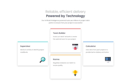
Responsive Four Card Feature - Using CSS Grid and Flexbox

Solution retrospective
I managed to apply my CSS grid skills to create the grid and then adapted it to be responsive by changing the amount of columns.
What challenges did you encounter, and how did you overcome them?Getting the 1-2-1 card pattern was something I had the right idea for, but the wrong implementation at first. So after a quick search, I managed to solve that issue and get them to be as expected.
What specific areas of your project would you like help with?Just reviewing if there was a more efficient way to do the card restructure, or if that is the best way to go about it.
Please log in to post a comment
Log in with GitHubCommunity feedback
- @DomCroatia
Hey, very nice solution. I'm not sure if there is more efficient way to do the grid segment, but I saw some people did it with flex instead of grid. Not necessarily better just different.
- @AMALK319
Well done


Join our Discord community
Join thousands of Frontend Mentor community members taking the challenges, sharing resources, helping each other, and chatting about all things front-end!
Join our Discord