Skip to content
  • Unlock Pro
  • Log in with GitHub
Solution
Submitted 2 months ago

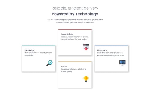
Responsive Four Card Feature Section (Flexbox/Grid) Mobile-First

Fernando Luis Pizarro•280
@fernandopizarrodw
A solution to the Four card feature section challenge
View live sitePreview (opens in new tab)View codeCode (opens in new tab)

Solution retrospective


What are you most proud of, and what would you do differently next time?

I'm most proud of achieving the intended layout, especially the initial attempt using Flexbox to create the staggered effect of the cards. Although it involved some complex negative margins, I learned a lot about how Flexbox can be manipulated.

Next time, I would definitely approach the layout with CSS Grid from the beginning. While I managed to get the visual result with Flexbox, Grid proved to be a much more intuitive and cleaner solution for this two-dimensional layout, as demonstrated by the solution provided by the community. This experience highlighted the importance of choosing the right tool for the job.

What challenges did you encounter, and how did you overcome them?

The main challenge was initially trying to position the four cards in the specific staggered, almost diamond-like layout using Flexbox. I spent a significant amount of time playing with margins, including negative margins, to achieve the desired visual.

I overcame this by exploring alternative layout methods and realizing that CSS Grid was a more semantically appropriate and efficient solution for this type of two-dimensional arrangement. Reviewing Grid concepts and seeing a Grid-based solution helped me understand its power for these scenarios.

What specific areas of your project would you like help with?

I'd appreciate feedback on:

Best practices for choosing between Flexbox and Grid for different layout scenarios. This challenge really highlighted the strengths of Grid for bidimensional layouts, and I'd like to solidify my understanding of when to prefer one over the other. Code clarity and organization in my CSS, especially in the Flexbox attempt. Are there ways I could have structured the Flexbox solution more effectively, even if Grid was the better overall choice? Responsiveness of the layout across different screen sizes. While I aimed for a responsive design, feedback on how well it adapts to various viewport widths would be valuable.

Code
Select a file

Please log in to post a comment

Log in with GitHub

Community feedback

  • Mahisha Gunasekaran•120
    @Mahi-Mani
    Posted 15 days ago

    Flexbox - Can be used if the layout is simple. If we need to align the contents either vertically or horizontally, then flexbox is easy and ideal one to choose.

    Grid - If we need to align the contents both vertically and horizontally then grid is the ideal choice.

    Media queries - Consider writing rules for different screen sizes. Have breakpoints like (350px, 700px, 1000px, 1200px..)

    Marked as helpful

Join our Discord community

Join thousands of Frontend Mentor community members taking the challenges, sharing resources, helping each other, and chatting about all things front-end!

Join our Discord
Frontend Mentor logo

Stay up to datewith new challenges, featured solutions, selected articles, and our latest news

Frontend Mentor

  • Unlock Pro
  • Contact us
  • FAQs
  • Become a partner

Explore

  • Learning paths
  • Challenges
  • Solutions
  • Articles

Community

  • Discord
  • Guidelines

For companies

  • Hire developers
  • Train developers
© Frontend Mentor 2019 - 2025
  • Terms
  • Cookie Policy
  • Privacy Policy
  • License

Oops! 😬

You need to be logged in before you can do that.

Log in with GitHub

Oops! 😬

You need to be logged in before you can do that.

Log in with GitHub

How does the accessibility report work?

When a solution is submitted, we use axe-core to run an automated audit of your code.

This picks out common accessibility issues like not using semantic HTML and not having proper heading hierarchies, among others.

This automated audit is fairly surface level, so we encourage to you review the project and code in more detail with accessibility best practices in mind.

How does the CSS report work?

When a solution is submitted, we use stylelint to run an automated check on the CSS code.

We've added some of our own linting rules based on recommended best practices. These rules are prefixed with frontend-mentor/ which you'll see at the top of each issue in the report.

The report will audit all CSS, SCSS and Less files in your repository.

How does the HTML validation report work?

When a solution is submitted, we use html-validate to run an automated check on the HTML code.

The report picks out common HTML issues such as not using headings within section elements and incorrect nesting of elements, among others.

Note that the report can pick up “invalid” attributes, which some frameworks automatically add to the HTML. These attributes are crucial for how the frameworks function, although they’re technically not valid HTML. As such, some projects can show up with many HTML validation errors, which are benign and are a necessary part of the framework.

How does the JavaScript validation report work?

When a solution is submitted, we use eslint to run an automated check on the JavaScript code.

The report picks out common JavaScript issues such as not using semicolons and using var instead of let or const, among others.

The report will audit all JS and JSX files in your repository. We currently do not support Typescript or other frontend frameworks.

Oops! 😬

You need to be logged in before you can do that.

Log in with GitHub