Submitted 11 months agoA solution to the Four card feature section challenge
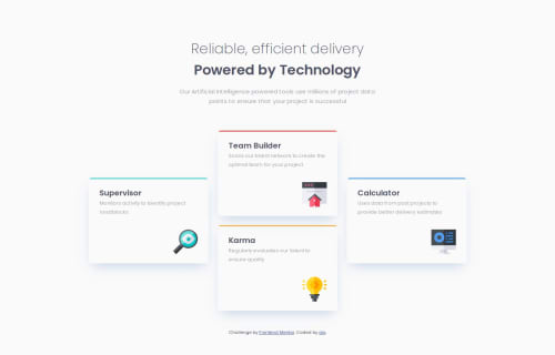
Responsive four card feature section

@fakegio
Solution retrospective
What are you most proud of, and what would you do differently next time?
I am most proud of getting the project to look similar to the design. Next time, I would focus more on getting the spacing right.
What challenges did you encounter, and how did you overcome them?The challenge I encountered was the grid container on the desktop version wasn't working correctly as intended, this was solved by realizing i selected the wrong element.
What specific areas of your project would you like help with?Semantics
Code
Please log in to post a comment
Log in with GitHubCommunity feedback
- P@EfthymiosK
Excellent job! Couple details I can mention is that you should begin by H1 and not H2 (https://dequeuniversity.com/rules/axe/4.6/heading-order?application=axeAPI), and that your mobile version is not responsive from 320px. Other than that, well done!

Join our Discord community
Join thousands of Frontend Mentor community members taking the challenges, sharing resources, helping each other, and chatting about all things front-end!
Join our Discord