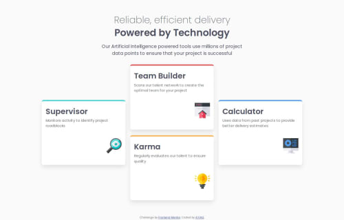
Responsive four card feature section master with bootstrap

Solution retrospective
I’m most proud of how I managed to replicate the desktop layout with accurate alignment and spacing between the cards. It was challenging at first, but once I figured out the right HTML structure and CSS adjustments, the design came together nicely. I also feel proud that I’m starting to apply best practices instinctively, such as using CSS custom properties and thinking mobile-first.
Next time, I would spend more time planning the layout structure before coding, especially for complex desktop designs. This could help me avoid trial-and-error and speed up the process. I’d also like to experiment more with CSS Grid to handle card arrangements more efficiently.
What challenges did you encounter, and how did you overcome them?The main challenge was aligning the cards correctly on desktop screens, especially ensuring the center cards had the right spacing between them and balanced margins with the side cards. Initially, the cards looked uneven and the spacing felt off.
I overcame this by carefully analyzing the design and using Bootstrap’s grid system along with custom CSS media queries. Adding padding and gap adjustments inside the media query helped me achieve the desired layout. Also, limiting the paragraph width in the header improved readability and matched the design better.
What specific areas of your project would you like help with?I would appreciate feedback on how to optimize the layout for desktop screens, particularly:
Are there more efficient ways to manage spacing between cards without relying heavily on padding and margin tweaks?
Would using CSS Grid instead of Flexbox and Bootstrap grid improve the responsiveness or maintainability of the layout?
Any tips on structuring media queries for complex multi-column layouts to keep the CSS clean and scalable?
Additionally, I’m open to suggestions on improving accessibility and semantic HTML in this kind of card-based layout.
Please log in to post a comment
Log in with GitHubCommunity feedback
- @thisisharsh7
Great job on solving Four card feature section challenge! Your mobile-first approach and CSS custom properties reflect strong best practices.
Suggestions:
- Card Spacing Optimization: Instead of padding/margin tweaks (e.g.,
.cards { padding: 2rem }), consider CSS Grid withgap(e.g.,grid-template-columns: repeat(3, 1fr); gap: 2rem) for consistent spacing. This simplifies layout management without relying on Bootstrap’s grid. - CSS Grid vs. Bootstrap/Flexbox: Using CSS Grid (
display: grid) for.boxinstead of Bootstrap’s row-column system would improve maintainability. Definegrid-template-areasfor explicit card placement, enhancing scalability for complex layouts. - Single Styling Approach: Mixing Bootstrap and custom CSS (e.g.,
.cardsstyles) can lead to conflicts. Choose one method: either fully leverage Bootstrap’s utilities (e.g.,p-4,mb-3) or use pure CSS for better control and consistency. Consolidate intostyle.cssfor clarity. - Media Query Structure: Group related styles under one
@mediablock (e.g.,@media (min-width: 1200px)) to keep CSS scalable. Use consistentmin-widthbreakpoints (768px, 1200px). - Accessibility/Semantics: Use
<h3>for.nameinstead of<h2>to maintain heading hierarchy after<h1>. Addaria-labelsto images (e.g.,alt="Supervisor icon").
Tip: Add hover effects (e.g.,
.cards:hover { transform: scale(1.05); transition: transform 0.3s ease; }) for visual look.Excellent work overall!
Marked as helpful - Card Spacing Optimization: Instead of padding/margin tweaks (e.g.,

Join our Discord community
Join thousands of Frontend Mentor community members taking the challenges, sharing resources, helping each other, and chatting about all things front-end!
Join our Discord