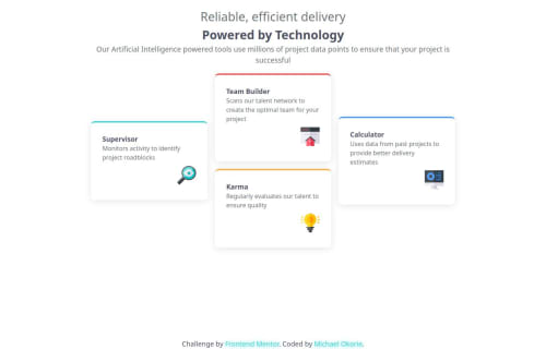
Responsive four card feature section using CSS Grid layout

Solution retrospective
I'm proud of how clean and responsive the layout turned out, especially the desktop "+" grid structure that mimics the original design. Next time, I would structure my HTML more cleanly from the start to make layout management easier. I’d also use CSS Grid earlier instead of Flexbox since it fits this layout better.
What challenges did you encounter, and how did you overcome them?One of the biggest challenges was translating the visual layout into a working grid that adapts well across devices. Initially, I tried using Flexbox but had difficulty achieving the exact positioning. I solved this by switching to CSS Grid and assigning grid areas manually, which made everything much easier to align.
What specific areas of your project would you like help with?I'd love feedback on my use of CSS Grid—especially if there are more efficient or scalable ways to achieve this layout. I’m also open to suggestions on improving my code structure and responsiveness for different screen sizes.
Please log in to post a comment
Log in with GitHubCommunity feedback
No feedback yet. Be the first to give feedback on Michael Okorie's solution.
Join our Discord community
Join thousands of Frontend Mentor community members taking the challenges, sharing resources, helping each other, and chatting about all things front-end!
Join our Discord