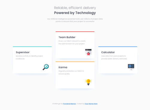
Not Found
Not Found
Not Found
Not Found
Not Found
Not Found
Not Found
Not Found
Not Found
Not Found
Not Found
Not Found
Not Found
Not Found
Not Found
Not Found
Not Found
Not Found
Not Found
Not Found

Submitted

Responsive Four card feature section using flexbox and SASS

@Briancarlo24

Desktop design screenshot for the Four card feature section coding challenge

This is a solution for...

  • HTML
  • CSS
1newbie
View challenge

Design comparison


SolutionDesign

Solution retrospective


Did I do this challenge right?

Community feedback

Davide 1,725

@Da-vi-de

Posted

Hi, good result on this challenge. Almost perfect!

  • I saw the comment "Desktop design" but the media query is min-width: 375px, it's too early making desktop design at that width. You should have tried a different strategy so that it would look good on a tablet as well. When there's no tablet design it means there's nothing to change nor to add! If i open the website at 768px (common tablet size) it doesn't show all the card properly, two of them are cut, because you already coded desktop design!

Keep coding :-)

Marked as helpful

1

@Briancarlo24

Posted

@Da-vi-de Thanks for your feedback Davide,

I intentionally did not put any table design since the challenge didn't require it. But it does look bad when after checking it again. I will definitely consider adding tablet design soon. :D

1

Please log in to post a comment

Log in with GitHub
Discord logo

Join our Discord community

Join thousands of Frontend Mentor community members taking the challenges, sharing resources, helping each other, and chatting about all things front-end!

Join our Discord