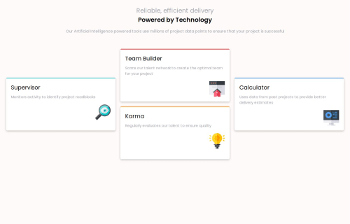
Submitted almost 2 years agoA solution to the Four card feature section challenge
responsive four card feature section using html and css
LVL 2

@Codingtry123
Solution retrospective
What are you most proud of, and what would you do differently next time?
write media width with consistent order
What challenges did you encounter, and how did you overcome them?how do I use grid-row grid-column to put element in a grid container take existing gap into consideration when using grid-template
What specific areas of your project would you like help with?how do I using media query to write mobile first website
Code
Loading...
Please log in to post a comment
Log in with GitHubCommunity feedback
No feedback yet. Be the first to give feedback on anthony’s solution.
Join our Discord community
Join thousands of Frontend Mentor community members taking the challenges, sharing resources, helping each other, and chatting about all things front-end!
Join our Discord