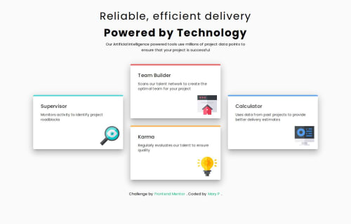
Responsive four card feature section with Vuejs, Vuetify and CSS grid

Solution retrospective
I´m proud that I could configure Vuetify on Vitejs app. I´m a beginner in Vue, I have coded mostly with React.
What challenges did you encounter, and how did you overcome them?-
for a v-card component with different layouts for the mobile and desktop I used Vue conditional rendering v-if directive, useWindowSize() and useScreenOrientation();
-
to force the component to rerender if screen orientation changes I added eventListener to detect the orientation and key reference to the component I wanted to rerender.
If testing the layout on Chrome devtools, layout is well detected and changed according to screen orientation but when changing device, I have to make a manual refresh to the page. I wounder if I´m overthinking as this kind of situation won´t come up in real life. Or am I mistaken?
Please log in to post a comment
Log in with GitHubCommunity feedback
No feedback yet. Be the first to give feedback on Mary2021's solution.
Join our Discord community
Join thousands of Frontend Mentor community members taking the challenges, sharing resources, helping each other, and chatting about all things front-end!
Join our Discord