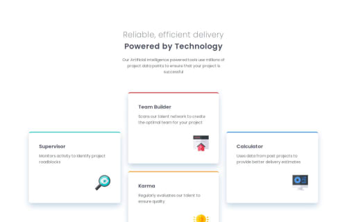
Responsive four card layout using flexbox and scss

Solution retrospective
Used a mobile first approach to build a responsive website and used sass mixins, functions to control the breakpoints.
What challenges did you encounter, and how did you overcome them?First time using a mobile first approach to building the site so awkward at first, but slowly got used to it with help of Google and other resources.
Please log in to post a comment
Log in with GitHubCommunity feedback
- P@WeatherheadOnline
Nice responsiveness. Don't forget to include media queries for tablets, too. (I'll admit that's something I've found challenging.) Here's something you could try:
@media (any-hover: hover)for devices with a mouse or other pointer device, to target desktop screens, and@media (any-hover: none)for devices without a mouse, ie phones and tablets. After that, I usually target tablets with something like:@media (any-hover: none) and (min-width: 700px)(I used 700px based on the widths of tablet and phone screens in browser devtools). Regardless, your solution looks good.Marked as helpful

Join our Discord community
Join thousands of Frontend Mentor community members taking the challenges, sharing resources, helping each other, and chatting about all things front-end!
Join our Discord