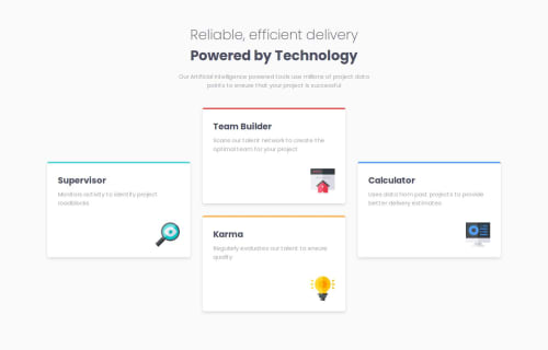
Responsive four card selection using BEM notation, transition

Solution retrospective
I managed to use transitions for hovering the cards, BEM notation and also a layout for tablet view.
What challenges did you encounter, and how did you overcome them?It was difficult to make the layout for the desktop design. I used to CSS Grid Garden resource that was provided in the learning path to get familiar with grid properties. Then I could easily implement the layout.
Please log in to post a comment
Log in with GitHubCommunity feedback
- P@MikDra1
Nice one 😀
If you are curious how you can do this straight lines on the top of each card here is my tip:
Create another element in each of the cards. Then position this element absolute. Card should be positioned relative. At the end you need to give this element a height of 3px width of 100% and top 0 and left 0. You can also use ::after or ::before pseudo elements to create these.
Hope you found this comment helpful 💗
Good job and keep going 😁😊😉
Marked as helpful - P@Stroudy
Looking at your code aswell I learned another way, On the
.features__iconI usedmargin-left: auto;and you usedalign-self: flex-end;Same job different way, This is why I like looking at other peoples solutions.Marked as helpful - P@Stroudy
Hey, I'm not doing any deep dive code reviews at the moment but I took a quick look at the code and noticed that removing the
max-width: 20%;property from the.features__iconclass seems to improve the visual presentation. The icon appears less constrained and more proportionate without the shrink effect.


Join our Discord community
Join thousands of Frontend Mentor community members taking the challenges, sharing resources, helping each other, and chatting about all things front-end!
Join our Discord