Submitted 2 months agoA solution to the Four card feature section challenge
Responsive Four feature card section using HTML, CSS flexbox and grid
pure-css

@Zarah679
Solution retrospective
What are you most proud of, and what would you do differently next time?
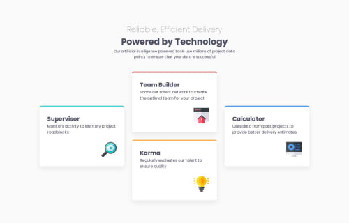
What I am most proud of is that i was able to structure my cards in a way that was very similar to the provided design figma files on the desktop screen. I achieved this using Grid.
What challenges did you encounter, and how did you overcome them?I am finding it hard making it responsive on smaller screens, tablets and mobile. For tablet, i am not getting the grid template rows right. For mobile, I know the code to make it into one column but i feel like a previous style is blocking the responsiveness on mobile.
What specific areas of your project would you like help with?I need help with grid responsiveness on mobile and tablet
Code
Loading...
Please log in to post a comment
Log in with GitHubCommunity feedback
No feedback yet. Be the first to give feedback on Fatima S's solution.
Join our Discord community
Join thousands of Frontend Mentor community members taking the challenges, sharing resources, helping each other, and chatting about all things front-end!
Join our Discord