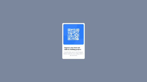
Responsive frontend mentor qr code challenge

Solution retrospective
please give me suggestions for coding for mobile responsive design because that particular section I'm not sure of and currently learning how to do.
Please log in to post a comment
Log in with GitHubCommunity feedback
- @Debesta
Well in this project I think you don't have to make mobile design because it's only one card, but in projects with e. g. 3 cards you can set them up in a columnar arrangement on mobile devices and in a row arrangement on devices with larger monitors. I always make it so that the code at the top is for mobile devices and I don't use @media queries there, then to change, for example, the position of an element on larger monitors I use @media queries, on the Internet you can find optimized breakpoints, first breakpoint is 576px (usually tablets start at this width), if I want to make changes on this breakpoint I just type:
@media (min-width: 576px){ ................ }
You will see changes in a given breakpoint after crossing such a screen width as in the argument.
Marked as helpful

Join our Discord community
Join thousands of Frontend Mentor community members taking the challenges, sharing resources, helping each other, and chatting about all things front-end!
Join our Discord