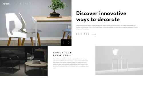
Responsive furniture homepage using React and Tailwind CSS

Solution retrospective
I am now confident enough to write particular classes used in Tailwind CSS
What challenges did you encounter, and how did you overcome them?I was facing difficult to design mobile navbar as in mobile screens, upon clicking the hamburger icon the list items would appear. I looked youtube videos to overcome this challenge and learnt the thought process behind it
What specific areas of your project would you like help with?In my design, I have placed the slider component at the bottom right container of image using absolute positioning. However, as per the design it should be placed at the center where it touches the corner points of two images. It would be very helpful if you could provide some tips to achieve this as I was not able to figure it out.
Please log in to post a comment
Log in with GitHubCommunity feedback
No feedback yet. Be the first to give feedback on Ayush Kumar Das's solution.
Join our Discord community
Join thousands of Frontend Mentor community members taking the challenges, sharing resources, helping each other, and chatting about all things front-end!
Join our Discord