


Vanza Setia• 27,855
@vanzasetia
Posted
Hi Robin! 👋
Sorry for giving feedback now. My internet connection was bad (it is still 😅).
Anyway, good effort on this challenge! 👍
Some feedback from me.
- The
navshould be wrapped byheaderlandmark. It's important for all page content lives inside the landmarks because screenreader users can use those landmarks to navigate the website. - The logo should have alternative text. It's also commonly wrapped by an anchor tag. It usually works as a link to navigate the users to the home page.
- I suggest combining the first section with the second section as one section. So, change both
sectiontags asdivand wrapped thosedivwith a singlesection.
<section>
  <div id="section1">
    ....
  </div>
  <div id="section1">
    ...
  </div>
</section>
- For the third section, I recommend changing it as a list item instead of a section. If you disable CSS and think about the HTML markup, I would think they should be a list instead of heading with text.
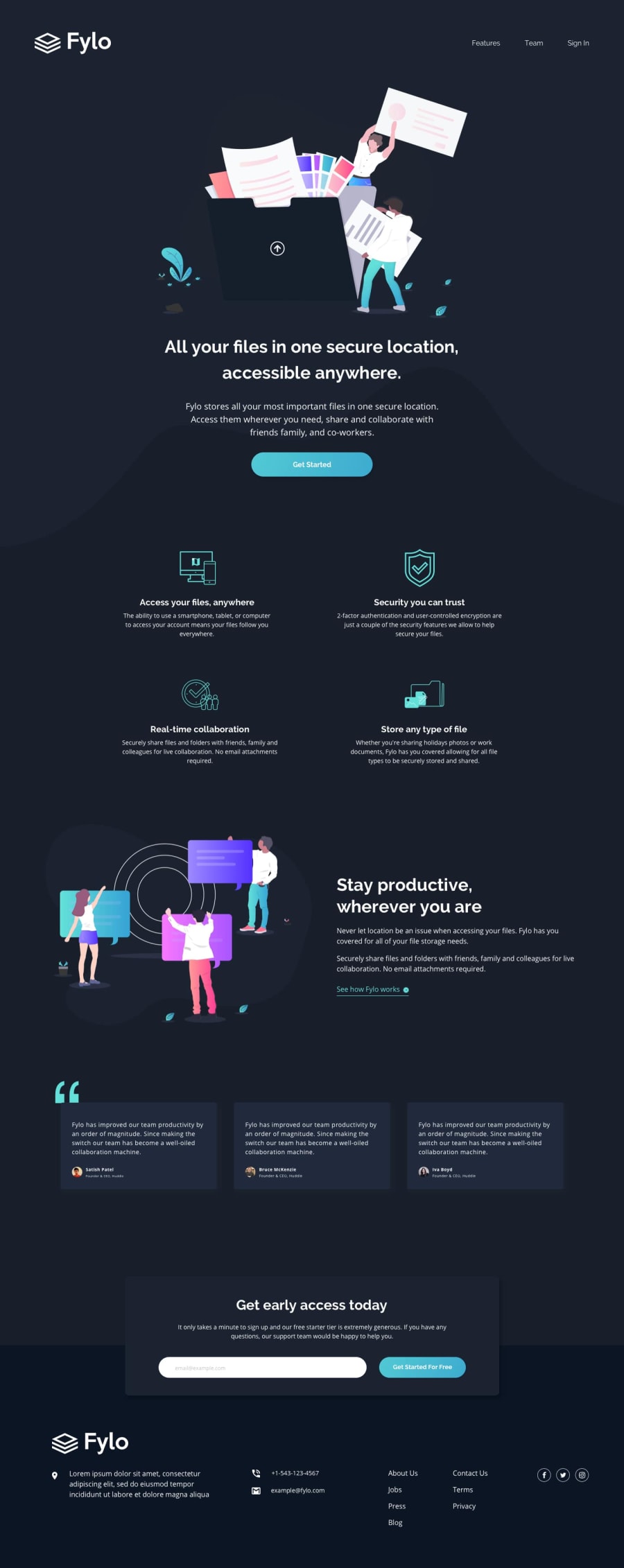
- Access your files, anywhere - The ability to use a smartphone, tablet, or computer to access your account means your files follow you everywhere.
- Security you can trust - 2-factor authentication and user-controlled encryption are just a couple of the security features we allow to help secure your files.
- etc...
- Also, try to refactor the HTML markup by thinking of the site as a document file. So, heading as a title, etc.
- Links need text content. So, use
aria-labelto add text content for those social media links. - Your attribution should live inside the
footer.
Some general advice.
- Use single class selectors for styling whenever possible instead of
id.idhas high specificity which can lead to a lot of issues on the larger project. It's best to keep the CSS specificity as low and flat as possible. 😉 - I highly recommend writing the styling using the mobile-first approach. It often leads to shorter and better performance code. Also, mobile users won't be required to process all of the desktop styles.
That's it! Hope this helps and happy coding! 😄
Marked as helpful
2
Robin Dela Cruz• 80
@robin-dc
Posted
@vanzasetia Thank you for your feedback 😊. I'm so glad to have my solution getting critique. I will surely apply your advice on my next projects. Its a big help for me. Happy coding!😄
1
Vanza Setia• 27,855
@vanzasetia
Posted
@robin-dc No problem! 👍
1
