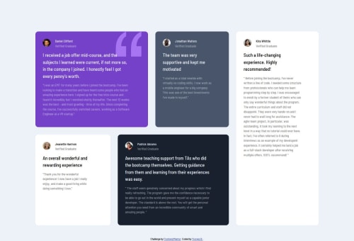
Responsive grid card layout

Solution retrospective
I focused on trying css grid (which I don't use usually because I feel more comfortable with flexbox). I also used Tachyons again partly since there is no css grid classes in tachyons (as far as I know at least).
What challenges did you encounter, and how did you overcome them?Working on the sizes and colours without having the Figma designs was a bit time consuming. I can always bring a screenshot on Figma and take from there exact measurements, which I partly do, but this is very time consuming and I don't want to spend so much time on it. So the layout is not pixel perfect but accurate enough for what I want to achieve.
What specific areas of your project would you like help with?Semantic html choices. I was a bit puzzled and not sure if I made the right choices at the end.
Please log in to post a comment
Log in with GitHubCommunity feedback
No feedback yet. Be the first to give feedback on Yiorgos Bagakis's solution.
Join our Discord community
Join thousands of Frontend Mentor community members taking the challenges, sharing resources, helping each other, and chatting about all things front-end!
Join our Discord