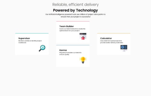
Responsive Grid four card section project

Solution retrospective
I am proud of incorporating semantic HTML elements such as <main> and <section>, which help improve the structure and accessibility of the webpage. These elements contribute to better readability for both humans and machines, like search engines and screen readers. Additionally, I made sure to include alt text for all images, which enhances accessibility for users with visual impairments. This small yet significant step improves the overall inclusivity of the site.
Most importantly, this project deepened my understanding of the grid system and how it works. I learned how to effectively use CSS Grid to create flexible and responsive layouts, which allowed me to arrange the cards in a neat and organized way. I also gained a deeper understanding of the importance of creating a clean and user-friendly interface. Moreover, by focusing on accessibility, I realized how essential semantic HTML tags and alt text are for improving usability and inclusivity.
What challenges did you encounter, and how did you overcome them?Grid has always been a challenge for me, but after going through some of the recommended materials, I was able to overcome the challenge and complete the project. It took time and practice, but understanding the core principles of the CSS Grid system, such as grid-template-columns, grid-template-rows, and how to span items across multiple rows or columns, helped me feel more confident using it in my design.
Please log in to post a comment
Log in with GitHubCommunity feedback
- @skyv26
Hi @Gentlestan 😊
You've done a great job with your page, and I appreciate the effort you’ve put into it! Here are a few friendly suggestions to help make it even better:
🔧 CSS Refinement Suggestions
-
Embrace the Box Model:
I noticed some unnecessary space around the webpage. Consider using a universal CSS reset to normalize the browser's default styles. This will help you have better control over your layout and eliminate that extra margin or padding around the page. 🚀Example:
* { margin: 0; padding: 0; box-sizing: border-box; } -
Avoid Unnecessary Heights:
In your.cardclass, it’s better to let the content inside dictate the height rather than setting a fixed value. Using padding and margins for spacing can achieve the desired height more naturally and maintain responsiveness. 🌟
👍 What You Did Well
- Great Use of Flexbox:
Kudos to you for aligning the card image to the bottom right usingflexbox! Many people take a more complicated route for this. Your approach is clean and efficient—amazing work here! 👏
📐 Responsiveness Tip
-
Revisit the Main Width:
While setting your main element to 80% width might look fine on smaller screens, it feels restrictive on larger screens, especially with the contrasting background colors. Allowing the width to scale more dynamically (e.g., usingmax-widthormin-width) could provide a better user experience. For instance:main { max-width: 1200px; margin: 0 auto; padding: 1rem; }
Keep up the great work! Your use of flexbox and attention to design details already set you apart. A few tweaks here and there, and your page will look polished and professional across all screen sizes. 🎉
Feel free to reach out if you need any further guidance. Cheers! 😊
Marked as helpful -

Join our Discord community
Join thousands of Frontend Mentor community members taking the challenges, sharing resources, helping each other, and chatting about all things front-end!
Join our Discord