Skip to content
  • Unlock Pro
  • Log in with GitHub
Solution
Submitted 5 months ago

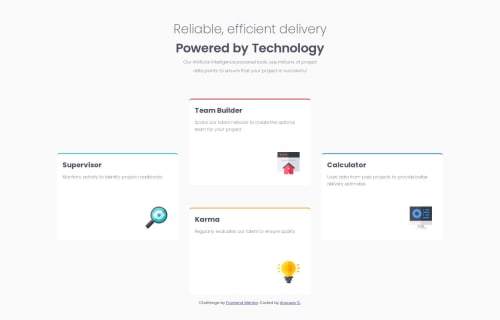
responsive grid media query

P
Xay•240
@xayrax88
A solution to the Four card feature section challenge
View live sitePreview (opens in new tab)View codeCode (opens in new tab)

Solution retrospective


What are you most proud of, and what would you do differently next time?

I would like to add more break points next time for different screen sizes since I just stuck to a smaller screen size of 375px, I would like to add tablet and laptop sized screens another time. I will come back and add those other features later as well as accesibility features.

What challenges did you encounter, and how did you overcome them?

I had some sizing issues and had to go learn more in depth of the grid/row columns using the grid-template-area to further space out the boxes on the desktop version. I had some help looking up the resource online through MDN and chatGPT along the way had helped.

What specific areas of your project would you like help with?

I forgot to add the shadowing effect on each boxes as you'll notice the difference from mine and the original, I will go back and do that later but other than that, I am open to any feedback.

Code
Select a file

Please log in to post a comment

Log in with GitHub

Community feedback

  • P
    jeffgrahamcodes•260
    @jeffgrahamcodes
    Posted 5 months ago

    This solution demonstrates a strong use of semantic HTML, with appropriate elements like <main> and <section> providing clear structure. The headings are well-organized, creating a logical content hierarchy that supports accessibility and readability. However, the solution could benefit from adding meaningful alt text to images to ensure screen readers can describe their purpose. For decorative images, using alt="" ensures they are ignored by assistive technologies, further enhancing accessibility. Additionally, wrapping individual card components in <article> tags could improve semantic clarity, as these sections represent standalone content.

    The layout is visually appealing and closely matches the design provided. It adapts well to different screen sizes, maintaining alignment and spacing across breakpoints. The CSS is generally well-structured, but adding more comments to clarify sections and consolidating shared styles into reusable variables could improve maintainability. Overall, this is a polished and well-executed solution with minor improvements needed for accessibility and code optimization. Great work!

    Marked as helpful

Join our Discord community

Join thousands of Frontend Mentor community members taking the challenges, sharing resources, helping each other, and chatting about all things front-end!

Join our Discord
Frontend Mentor logo

Stay up to datewith new challenges, featured solutions, selected articles, and our latest news

Frontend Mentor

  • Unlock Pro
  • Contact us
  • FAQs
  • Become a partner

Explore

  • Learning paths
  • Challenges
  • Solutions
  • Articles

Community

  • Discord
  • Guidelines

For companies

  • Hire developers
  • Train developers
© Frontend Mentor 2019 - 2025
  • Terms
  • Cookie Policy
  • Privacy Policy
  • License

Oops! 😬

You need to be logged in before you can do that.

Log in with GitHub

Oops! 😬

You need to be logged in before you can do that.

Log in with GitHub

How does the accessibility report work?

When a solution is submitted, we use axe-core to run an automated audit of your code.

This picks out common accessibility issues like not using semantic HTML and not having proper heading hierarchies, among others.

This automated audit is fairly surface level, so we encourage to you review the project and code in more detail with accessibility best practices in mind.

How does the CSS report work?

When a solution is submitted, we use stylelint to run an automated check on the CSS code.

We've added some of our own linting rules based on recommended best practices. These rules are prefixed with frontend-mentor/ which you'll see at the top of each issue in the report.

The report will audit all CSS, SCSS and Less files in your repository.

How does the HTML validation report work?

When a solution is submitted, we use html-validate to run an automated check on the HTML code.

The report picks out common HTML issues such as not using headings within section elements and incorrect nesting of elements, among others.

Note that the report can pick up “invalid” attributes, which some frameworks automatically add to the HTML. These attributes are crucial for how the frameworks function, although they’re technically not valid HTML. As such, some projects can show up with many HTML validation errors, which are benign and are a necessary part of the framework.

How does the JavaScript validation report work?

When a solution is submitted, we use eslint to run an automated check on the JavaScript code.

The report picks out common JavaScript issues such as not using semicolons and using var instead of let or const, among others.

The report will audit all JS and JSX files in your repository. We currently do not support Typescript or other frontend frameworks.

Oops! 😬

You need to be logged in before you can do that.

Log in with GitHub