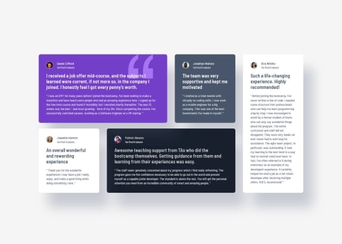
Responsive Grid section using all kinds stuff

Solution retrospective
This project was similar to the one I did before, and I used it as a chance to sharpen my CSS Grid skills even more. Along the way, I also picked up a couple of neat tricks.
-
Grid layout with
grid-template-areas: I usedgrid-template-areasagain to set up the layout. This time, I had to tweak the column sizes a bit to get the spacing just right. Playing with thegrid-template-columnshelped me balance how much space each section takes up. -
Profile pictures with a "fake" border: The profile pictures had a border (or stroke), but it wasn’t part of the actual image. I could’ve used
box-sizing: content-box;, but instead, I went with a little trick: I added abox-shadowthat mimics a border. It doesn’t mess with the box model and still gives the same look. 😄
Here’s a code snippet showing both things in action:
<header class="feature__header">
    <img class="feature__header--img feature__header--stroke-daniel" src="/images/image-daniel.jpg" alt="Profile picture of Daniel">
    <h3>Daniel Clifford</h3>
    <h4>Verified Graduate</h4>
</header>
.feature__header {
    display: grid;
    gap: 0.25rem 1.0625rem;
    grid-template-areas:
    "left right1"
    "left right2";
    grid-template-columns: auto 1fr;

    &--img {
        width: 28px;
        height: 28px;
        border-radius: 100%;

        grid-area: left;
    }
    &--stroke-patrick {
        box-shadow: 0px 0px 0px 2px $color-8;
        -webkit-box-shadow: 0px 0px 0px 2px $color-8;
        -moz-box-shadow: 0px 0px 0px 2px $color-8;
    }
    &--stroke-daniel {
        box-shadow: 0px 0px 0px 2px $color-9;
        -webkit-box-shadow: 0px 0px 0px 2px $color-9;
        -moz-box-shadow: 0px 0px 0px 2px $color-9;
    }
}
One challenge I ran into was getting the Grid items to have the correct size and spacing. It took a bit of experimenting to figure out how to control the ratio of space each item takes up. But honestly, it turned out to be a great way to dig deeper into CSS Grid. In the end, the solution was pretty straightforward — something like:
grid-template-columns: auto 1fr;
If anyone has a moment, I’d love some feedback on two of my files: _feature.scss and _cards.scss (specifically the //INDIVIDUAL CARD STYLES section).
Is the way I’m using Grid there effective? Would you simplify or improve anything?
Any tips, tricks, or advice—no matter how small—are very welcome and much appreciated!
Please log in to post a comment
Log in with GitHubCommunity feedback
No feedback yet. Be the first to give feedback on Michael's solution.
Join our Discord community
Join thousands of Frontend Mentor community members taking the challenges, sharing resources, helping each other, and chatting about all things front-end!
Join our Discord