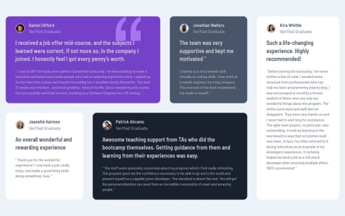
Responsive grid with clamp font size and flexbox

Solution retrospective
Proud of doing the challenge with less and less research for classes. Very proud of my grid design especially on tablet and small laptops as I felt like the grid layout was too cramped on smaller resolutions.
What challenges did you encounter, and how did you overcome them?I had trouble with image borders and I troubleshooted for a while. CSS as usual was the most time-consuming part. I had issues with styling classes and ID's that was a good way to learn that classes styling is superior to ID styling.
What specific areas of your project would you like help with?My text is not filling up completely the cards. If you have any idea on how to do this, I would be grateful
Please log in to post a comment
Log in with GitHubCommunity feedback
No feedback yet. Be the first to give feedback on LouisVerch's solution.
Join our Discord community
Join thousands of Frontend Mentor community members taking the challenges, sharing resources, helping each other, and chatting about all things front-end!
Join our Discord