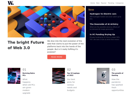
Skip to content
  • Unlock Pro
  • Log in with GitHub
Solution
Submitted over 2 years ago

Responsive home page using bootstrap 5

bootstrap, sass/scss
Caroline•210
@Carolkiarie
A solution to the News homepage challenge
View live sitePreview (opens in new tab)View codeCode (opens in new tab)

Solution retrospective


Hello all, this was my first project using bootstrap 5 and bait of sass. It is pretty rusty. For example, I was unable to change the background color of my off canvas. Any suggestion is welcome. Thank you and happy coding:)

Code
Select a file

Please log in to post a comment

Log in with GitHub

Community feedback

  • Vicktor•920
    @Victor-Nyagudi
    Posted over 2 years ago

    Hello, Caroline.

    Good attempt on this one.

    Here are some things you can improve.

    It seems you used a duplicate id value here.

    <div class="offcanvas offcanvas-end d-md-none" id="main-nav">
    

    These should be unique, otherwise, you might run into problems down the road. Consider finding the duplicate ID and changing it to something else. You can use Ctrl+F in VS Code (or its equivalent in your code editor) to find the duplicate id="main-nav" and change it.

    There's another warning in the accessibility report that heading levels should only increase by one. This means that you should structure your HTML such that you only have one <h1> at the top then following it should be an <h2> then <h3> etc.

    For example, you used an <h3> then <h2> in your code here.

    // previous code here
    
    <div class="col-sm-12 col-lg-4 bg-verydarkblue" > 
              <div class="card-body h-100 card-fluid pt-4 ">
                <h3 class="text-softorange">New</h3> // <- Here's the h3
                <ul class="list-group list-group-flush">
                  <li class="list-group-item bg-verydarkblue text-offwhite">
                    <h2 class="fw-bold fs-5 ">Hydrogen Vs Electric cars</h2> // <- Here's the h2
                  <p class="text-muted">Will hydrogen-fueled cars ever catch up
                    to EVs
                  </p>
                  </li>
    
    // other code below goes here
    

    Structuring your heading tags is important for accessibility because screen readers read them out in order from h1 to h6 to people with poor eyesight. Mixing heading tags makes navigation harder for them.

    You can switch the two heading tags above and style them such that one is bigger than the other but you still preserve the integrity of the headings structure.

    If you have code inside multiple <section> or <article> tags, you can start at an <h2> and go down from there.

    For example:

    <article> // <- You can replace this with a <section>
         <h2>10 Best Places To Buy Make-up In Nairobi</h3>
    
         <h3> Some of these depend on your budget</h3>
    
         <p>If you ever find yourself in one of East Africa's busiest cities...</p>
    </article>
    
    <article> 
         <h2>What Is Mutura Really?</h3>
    
         <h3> Is it boudin or a cow's large intestines?</h3>
    
         <p>Parked around street corners are many vendors selling the famous mutura...</p>
    </article>
    

    Finally, if you want to use an image as a link, remember to add an alt text to it so screen readers know where the link goes.

    <a href="#home" class="navbar-brand">
         <img src="assets/images/logo.svg" alt="Home">
    </a>
    

    Hope this helps.

    All the best with your future solutions.

    Marked as helpful
  • Amal Karim ✅•1,290
    @amalkarim
    Posted over 2 years ago

    Hi, Caroline 👋

    Congratulations for completing this challenging challenge!

    Here are some suggestions.

    • The background color of offcanvas is actually white. But because the modal-backdrop is placed in front of (or above) the offcanvas, its background looks like it's not white, and actually it becomes unaccessible (i.e. you cannot click the menu, instead you click modal-backdrop). To solve this, give offcanvas higher z-index than modal-backdrop, for example z-index: 1051; or higher.
    • Add × (close button) inside offcanvas, preferably above <ul class="navbar-nav mt-5 p-5 bg-offwhite">, place it in the same position as the hamburger menu, and add JavaScript code to make offcanvas hides when it is clicked.
    • I noticed the image width of the main article is less than its container width in certain screen sizes. It is because the image original width is just 680px. To avoid this issue, we could give specific styling to the image so the image width is always full at any given screen size. See the sample code below:
    @media screen and (min-width: 700px) and (max-width: 991px) {
        img.img-fluid.d-lg-none {
            width: 100%;
            height: 300px;
            object-fit: cover;
            object-position: top;
        }
    }
    
    • For the bottom section, instead of using the available classes in Bootstrap, try using your own classes or styles to avoid some issues, particularly the gap that is too wide, between one article and the other in desktop view, and between the image and the text in mobile view.

    If you're interested to see my solution, feel free to check them out

    Hope this helps. Happy coding!

    Marked as helpful

Join our Discord community

Join thousands of Frontend Mentor community members taking the challenges, sharing resources, helping each other, and chatting about all things front-end!

Join our Discord

Stay up to datewith new challenges, featured solutions, selected articles, and our latest news

Frontend Mentor

  • Unlock Pro
  • Contact us
  • FAQs
  • Become a partner

Explore

  • Learning paths
  • Challenges
  • Solutions
  • Articles

Community

  • Discord
  • Guidelines

For companies

  • Hire developers
  • Train developers
© Frontend Mentor 2019 - 2025
  • Terms
  • Cookie Policy
  • Privacy Policy
  • License

Oops! 😬

You need to be logged in before you can do that.

Log in with GitHub

Oops! 😬

You need to be logged in before you can do that.

Log in with GitHub

How does the accessibility report work?

When a solution is submitted, we use axe-core to run an automated audit of your code.

This picks out common accessibility issues like not using semantic HTML and not having proper heading hierarchies, among others.

This automated audit is fairly surface level, so we encourage to you review the project and code in more detail with accessibility best practices in mind.

How does the CSS report work?

When a solution is submitted, we use stylelint to run an automated check on the CSS code.

We've added some of our own linting rules based on recommended best practices. These rules are prefixed with frontend-mentor/ which you'll see at the top of each issue in the report.

The report will audit all CSS, SCSS and Less files in your repository.

How does the HTML validation report work?

When a solution is submitted, we use html-validate to run an automated check on the HTML code.

The report picks out common HTML issues such as not using headings within section elements and incorrect nesting of elements, among others.

Note that the report can pick up “invalid” attributes, which some frameworks automatically add to the HTML. These attributes are crucial for how the frameworks function, although they’re technically not valid HTML. As such, some projects can show up with many HTML validation errors, which are benign and are a necessary part of the framework.

How does the JavaScript validation report work?

When a solution is submitted, we use eslint to run an automated check on the JavaScript code.

The report picks out common JavaScript issues such as not using semicolons and using var instead of let or const, among others.

The report will audit all JS and JSX files in your repository. We currently do not support Typescript or other frontend frameworks.

Oops! 😬

You need to be logged in before you can do that.

Log in with GitHub

Oops! 😬

You need to be logged in before you can do that.

Log in with GitHub