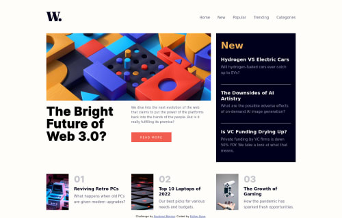
Responsive Home Page with CSS Grid, Media Queries

Solution retrospective
Is there a way to do this grid layout without having grids within grids?
Is there a better way to apply the dim background overlay on mobile when the menu is open?
Is there an easier way to make the grid responsive when screen size changes?
Please log in to post a comment
Log in with GitHubCommunity feedback
- @Ikuewumi
Hi ✋. Great project and about your questions, my suggestions are:
- Honestly, the only part needing grid is the middle section. In my experience, grid tends to do better with explicit layouts, while flex usually handles implict layouts (where the engine kinda just figures what do by itself) a lot better.
- About the backdrop, well there are at least two options:
Using pseudo-elements: You could use the
beforeorafterpseudo-elements or a kinda new one:backdropIt might go like this:css :before{ position: absolute; width: 100vw; height: 100vh; background-color: #00000020; }Although, here you could run into rare issues of z-index. You could solve that with the new
isolationcss propertyBut if all that sounds too complicated, a simpler one I would personally recommend is using a box-shadow (with a really large spread) It could go like:
selector {box-shadow: 0 0 0 200vmax #00000010}- About easier ways of making a responsive grid. Here I would say it pays to start writing CSS mobile-first because the default grid stacks children on top of each other which is what is usually preferred. Then you can add complexity on top with, like a media query or something for larger screens
Hope you find these useful. Above all, this is an awesome project. Feel free to ask more questions and keep coding👍,
Ayobami
Marked as helpful - @JesusEgonVenegas
regarding your first question, perhaps by using flex inside the grid? you did an awesome job though


Join our Discord community
Join thousands of Frontend Mentor community members taking the challenges, sharing resources, helping each other, and chatting about all things front-end!
Join our Discord