
Solution retrospective
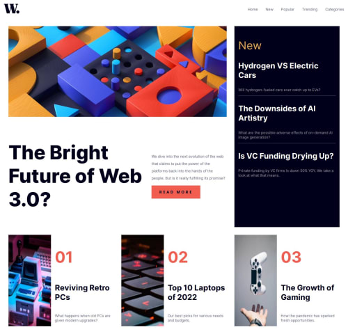
Aligning the image-web-3-mobile class of image-header with the h1 and paragraph as a display of flex for desktop-view was quite difficult for me, if there is a better way, please do leave a comment.
The navbar for mobile, that is the sidebar or hamburger-menu, building that was difficult, if there is an article that explains how to build a good sidebar for mobile do share them. I had problems moving the close-menu-icon to the extreme right.
Thanks for reviewing my code, suggestions to improve are highly welcome.
Please log in to post a comment
Log in with GitHubCommunity feedback
- @calvinvin
For the image-web-3-mobile-class of image-header with the h1 and paragraph, I saw you changed the display to grid instead. The layout would be more responsive if your set the grid-template-columns to 'auto auto' instead of '35rem 1fr'.
For some CSS and sidebar examples, I like Kevin Powell's youtube channel. He also makes an example based on this Frontend Mentor Challenge , where you can see other's way to make it.

Join our Discord community
Join thousands of Frontend Mentor community members taking the challenges, sharing resources, helping each other, and chatting about all things front-end!
Join our Discord