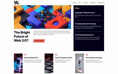
Responsive homepage using flexbox, grid

Solution retrospective
I'm most proud of building a fully responsive news homepage that adapts seamlessly across screen sizes—from mobile to desktop—using only semantic HTML, modern CSS (Flexbox & Grid), and a touch of JavaScript. The mobile menu interaction is accessible, animated smoothly, and works with both mouse and keyboard, which was a big focus for me.
What I would do differently next time is:
Refactor the JavaScript to be more modular and readable, especially as logic grows (e.g., trap focus inside the menu).
Explore using :focus-visible instead of :focus to improve accessibility without visual noise for mouse users.
Use CSS variables for spacing and typography too, not just colors, for better scalability.
Possibly structure the CSS with a preprocessor like SCSS to maintain larger stylesheets more efficiently.
What challenges did you encounter, and how did you overcome them?One of the biggest challenges was implementing a mobile navigation menu that is both visually smooth and accessible to screen readers and keyboard users. Managing the toggle logic with aria-hidden and ensuring that focus transitions correctly between elements took some experimentation.
Another challenge was balancing between Flexbox and CSS Grid for different screen sizes. I initially tried using only Grid but realized that Flexbox provided more flexibility for stacking content on mobile. Switching to a hybrid layout helped resolve those layout issues.
I also had to carefully manage focus states for accessibility—ensuring :focus outlines were visible and meaningful while keeping the design visually clean. Testing with the keyboard helped me identify which elements needed better focus styles or tabindex.
What specific areas of your project would you like help with?I'd love feedback on:
How to further improve the accessibility of the mobile navigation menu, especially things like focus trapping inside the menu when it's open.
Best practices for CSS architecture (e.g., BEM, utility-first, or component-based structure) as projects grow.
Ideas to make the homepage more dynamic—like adding theme toggles or user-preference features—while keeping performance and accessibility in mind.
Whether using a framework (like React or Vue) would have benefited a project of this size—or if plain HTML/CSS/JS is preferred for static sites like this.
Please log in to post a comment
Log in with GitHubCommunity feedback
No feedback yet. Be the first to give feedback on Lê Mạnh Đan's solution.
Join our Discord community
Join thousands of Frontend Mentor community members taking the challenges, sharing resources, helping each other, and chatting about all things front-end!
Join our Discord