Not Found
Not Found
Not Found
Not Found
Not Found
Not Found
Not Found
Not Found
Not Found
Not Found
Not Found
Not Found
Not Found
Not Found
Not Found
Not Found
Not Found
Not Found
Not Found
Not Found

Submitted

Responsive Image using max-width

#nuxt#sass/scss#vite#vuetify#bem

@MikeLee0358

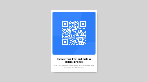
Desktop design screenshot for the QR code component coding challenge

This is a solution for...

  • HTML
  • CSS
1newbie
View challenge

Design comparison


SolutionDesign

Solution retrospective


what is the best way to handle with image and font-size RWD? I tried to limit the container to stop growing up.

Community feedback

P

@andreasremdt

Posted

Hey @MikeLee0358,

Congrats on finishing the challenge! Let me try and answer your questions:

To limit the width of the container, you can use max-width. I see that you used the clamp() function, which also works but is a little overkill for your needs. Setting max-width: 450px will prevent the container from growing any bigger but still stay flexible on smaller screen sizes.

The image inside the container is already set to width: 100%, which is great. It won't grow any bigger than the container and will shrink with it. I'd suggest adding the width and height attributes in the HTML, so that the browser knows how big the image is. This improves the loading experience, as the space is being "reserved" until the image has loaded. Also, don't forget to set height: auto in your CSS to maintain the correct aspect ratio at all times.

For this challenge, you don't need to change the font size for smaller devices if I remember correctly. So you're good already. Try to set the correct font family though, as this will improve the visuals a lot :-)

Some other things I noticed:

  • I would choose an h1 for the heading, as it's the first and only one. Headings in HTML should start from the highest level and descend down if necessary. Since you don't have any other headings, h1 is the best choice here.
  • Try and use more semantic HTML tags. For example, you could replace the div#QRCode with a main#QRCode to mark the card as the main landmark on this page. Semantics are an important aspect of HTML development and make life easier for search engines, screen readers, and others. Have a look here for more information.

By the way, the method you used to align and center everything (display: grid) is really clever, nice one!

Let me know if you have any questions, keep it up!

0

@MikeLee0358

Posted

@andreasremdt

Thank you for your feedbacks! It’s truly helpful to me

0

Please log in to post a comment

Log in with GitHub
Discord logo

Join our Discord community

Join thousands of Frontend Mentor community members taking the challenges, sharing resources, helping each other, and chatting about all things front-end!

Join our Discord