@turtlecrab
Posted
Hey, great job on this one! It works great on all screen sizes(maybe except for very very wide) and is really close to the design!
Some feedback:
- The
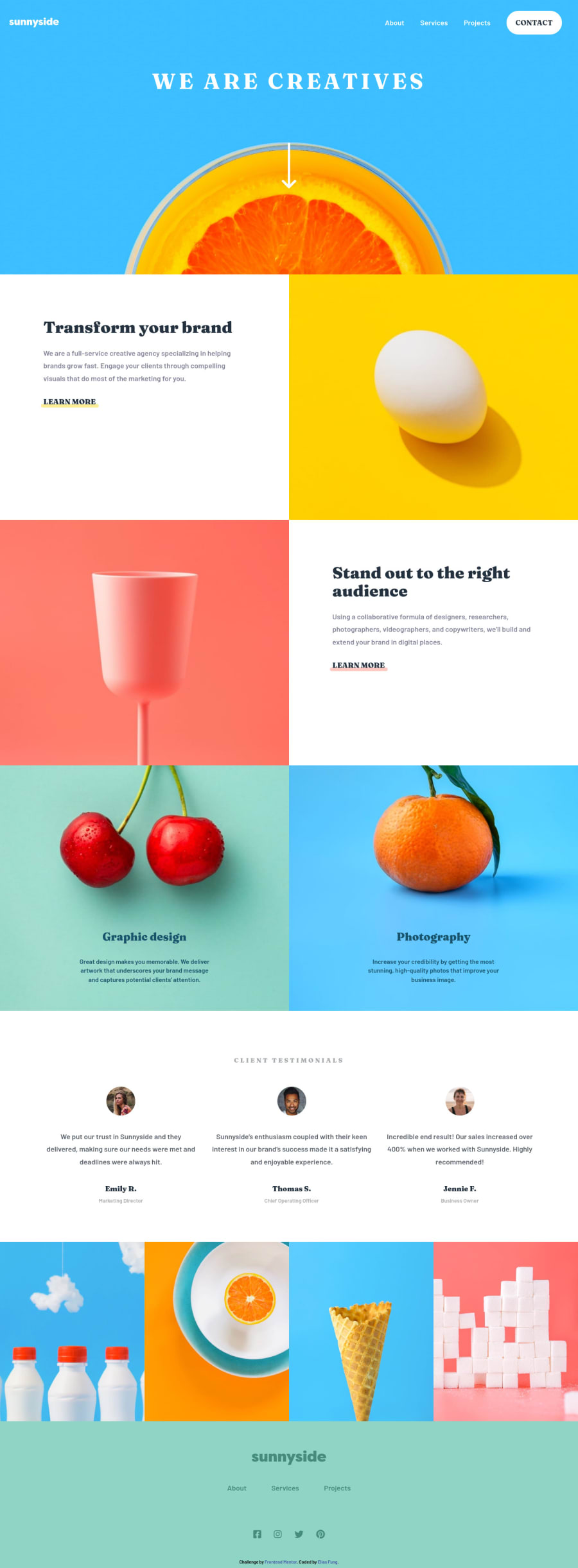
maintag should include all the followingsectiontags. It's semantic role is to show screen readers where the main content of the page is. More about it here - Bottom
divs that hold images belong to thefooterin my opinion, not themain. After these two fixes the accessibility warnings should be gone as all the content would be inside landmarks (header,mainandfooterin this case) - Usually we don't need to add the word "image" to
alttexts of images. Here is a great article about alt-texts: https://axesslab.com/alt-texts/, it explains the topic very well. - And in this case I think these bottom images are purely decorative, so I'd remove alt-texts from them (
<img ... alt="">). But if you think that these(or any other) images convey some information that people who don't see them should know about, then feel free to add image descriptions toalt. - Also a little bug: if we open the menu in mobile view and then resize the window to desktop view, then the menu stays and there is no way to hide it apart from going back to mobile screen size. This situation can happen in real life if a user goes from portrait to landscape orientation on their mobile, or if they just simply resize the window on desktop. I think adding
md:hiddento<div id="mobile-menu" ...should fix this.
Hope this helps!
Marked as helpful
@iManchai
Posted
@turtlecrab Ohh I see! Thank you so much for the feedback, really appreciate it!

