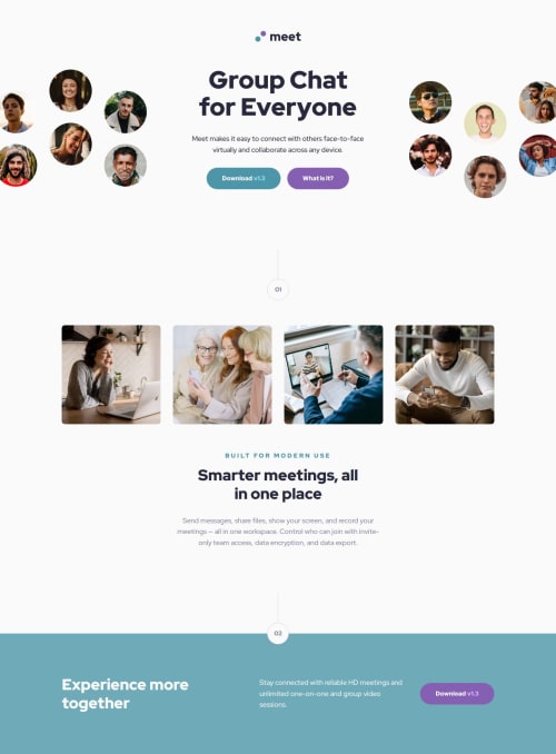
Responsive landing page challenge focused on modular SCSS architecture

Solution retrospective
I'm proud of the modular SCSS architecture, BEM structure, and how closely the final build matched the Figma design across all breakpoints. Next time, I would plan the breakpoint strategy even earlier—defining custom breakpoints upfront for a smoother responsive flow.
What challenges did you encounter, and how did you overcome them?Managing decorative images that extended beyond the viewport was tricky, especially with transform offsets and padding interactions. I overcame this by refining the container structure, controlling overflow properly, and using custom flex strategies for wrapping and spacing at critical breakpoints.
What specific areas of your project would you like help with?N/A
Please log in to post a comment
Log in with GitHubCommunity feedback
- P@CharlieCastleWeb
Hey James!
Awesome solution, I loved your styles structure.
Just a couple of things, the images in the main content appear in a row in tablet design. Also there's the footer image missing.
You might want to take a look at my solution, I try to follow ITCSS structure, a bit similar to your approach.
Nice job! I'm definitely getting some ideas to improve my solution from seeing your code!
Marked as helpful

Join our Discord community
Join thousands of Frontend Mentor community members taking the challenges, sharing resources, helping each other, and chatting about all things front-end!
Join our Discord