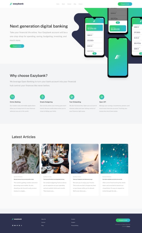
Submitted over 1 year agoA solution to the Digital bank landing page challenge
Responsive landing page for 3 different screens

@bravono
Solution retrospective
Creating the navigation bar was challenging. I'm not sure if my approach is the correct way to do it. What I did was to initially hide the navigation component with "display: none" when the screen is wider than a mobile device, and set it back to "block" when the screen shrinks down to the size of a mobile device.
Code
Loading...
Please log in to post a comment
Log in with GitHubCommunity feedback
No feedback yet. Be the first to give feedback on Ahbideen Yusuf's solution.
Join our Discord community
Join thousands of Frontend Mentor community members taking the challenges, sharing resources, helping each other, and chatting about all things front-end!
Join our Discord