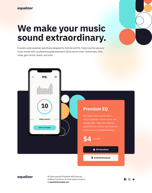
Responsive landing page. Tried to make it pixel perfect

Solution retrospective
What I learn :
- Fixing the differences between breaking point were fastidious but helped me to read better the style tab in the devtool.
- CSS files can become very long and even naming our selector correctly, it can be tough finding things.
- To avoid Float properties.
- How to manage within the Chrome screen resolution tab.
- Pixel perfect is not the good mindset to have as a designer.
I Never thought I would say that but coding for pixel perfect is extremely time consuming and I question the benefits for the user.
Searching for media query on how to target different browser size, I stumble on a Stackoverflow answer that took my attention. The user Dave Everitt suggest to avoid targeting specific devices or sizes. But rather doing the following :
- develop the site for mobile first using percentages or ems, not pixels,
- then try it in a larger viewport and note where it begins to fail,
- redesign the layout and add a CSS media query just to handle the broken parts,
- repeat the process until you reach the next breakpoint.
As a designer I like to know that my design will be seen as I designed it. But in the end, what for ? Isn't it better to give the user the best possible experience no matter what screen they are using? Let's get it right, I'm not saying design and precision are not important, I'm just saying we should just put the user's best interests first. The purpose of our design isn’t to help the users to achieve their goals ?
Please log in to post a comment
Log in with GitHubCommunity feedback
No feedback yet. Be the first to give feedback on Éric Férole's solution.
Join our Discord community
Join thousands of Frontend Mentor community members taking the challenges, sharing resources, helping each other, and chatting about all things front-end!
Join our Discord