Responsive Landing Page using Astro and TailwindCSS

Solution retrospective
Most proud of the fact that I could create the landing page using Tailwind CSS with relative ease. I also got a chance to use both flex box and CSS Grid for the design.
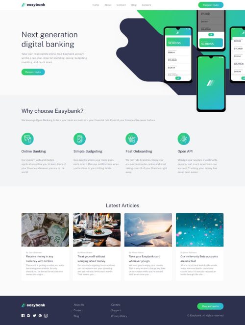
What challenges did you encounter, and how did you overcome them?The main challenge was the hero background images of the mockup mobile photo and the desktop/mobile intro photo. I tried my best to match the hero content with the design file. However, the hero content does not match, with the design files, as well compared to other sections of the landing page.
I used multiple media queries to allows the two background images of the hero content to gradually increase with higher screen width. However, the CSS I wrote is very messy.
What specific areas of your project would you like help with?I would greatly appreciate it if someone could heavily critique my design and suggest improvements regarding accessibility or the general readability of the code.
In particular, I would be very grateful if someone could help me fix my hero section to match the design file as much as possible. The current method of using multiple wrapper elements and media queries seems very cluttered.
Thanks a lot to the Frontend Mentor team for providing this challenge. It was really fun to do this challenge!
Please log in to post a comment
Log in with GitHubCommunity feedback
No feedback yet. Be the first to give feedback on Mehar Giri's solution.
Join our Discord community
Join thousands of Frontend Mentor community members taking the challenges, sharing resources, helping each other, and chatting about all things front-end!
Join our Discord