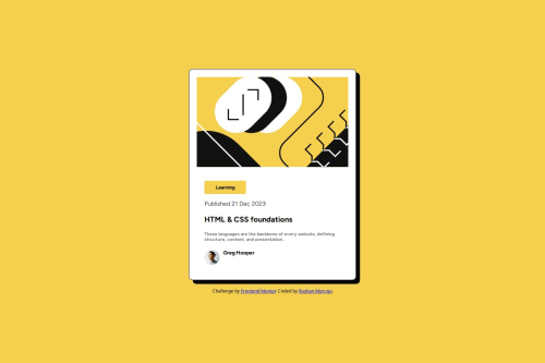
Responsive Landing Page using Bootstrap Grid & Flexbox (Adjust based o

Solution retrospective
I’m most proud of how I structured the layout using Bootstrap Grid and Flexbox for responsiveness. The design adapts well across different screen sizes, maintaining a clean and modern look.
Next time, I would optimize my CSS further by reducing redundant styles and making better use of reusable utility classes. I’d also experiment with animations to enhance user experience.
What challenges did you encounter, and how did you overcome them?One challenge I faced was ensuring proper spacing and alignment between sections on different screen sizes. Initially, some elements were misaligned in smaller viewports. I resolved this by fine-tuning Bootstrap’s grid system, adjusting column sizes, and using media queries for additional tweaks.
Another challenge was making the navigation bar fully responsive. Using Bootstrap’s navbar utilities and some custom CSS, I ensured smooth transitions between desktop and mobile layouts.
What specific areas of your project would you like help with?I’d love feedback on:
-
Optimizing my CSS to reduce redundancy while keeping styles maintainable.
-
Best practices for structuring a responsive navbar that scales well.
-
Accessibility improvements—are there any areas where I could enhance usability for screen readers?
Please log in to post a comment
Log in with GitHubCommunity feedback
No feedback yet. Be the first to give feedback on Roshan Merugu's solution.
Join our Discord community
Join thousands of Frontend Mentor community members taking the challenges, sharing resources, helping each other, and chatting about all things front-end!
Join our Discord