Skip to content
  • Unlock Pro
  • Log in with GitHub
Solution
Submitted almost 3 years ago

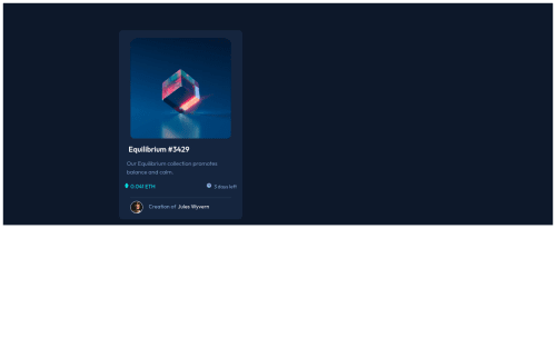
responsive landing page using css and html

jeevitha•70
@jeevitha1123
A solution to the NFT preview card component challenge
View live sitePreview (opens in new tab)View codeCode (opens in new tab)

Solution retrospective


well, i found difficulty in hovering equilibrium image over another image and learnt a lot from this challenge. any suggestions and comments kindly welcome.

Code
Select a file

Please log in to post a comment

Log in with GitHub

Community feedback

  • Trenton Bensheimer•190
    @tbensheimer
    Posted almost 3 years ago

    Hello and congrats on finishing this project! It looks great and very similar!

    One thing to suggest is add a width of 100% to the main with the container class and also add a height of 100vh (viewport height) as well. This will allow you to cover the whole page with the dark background with no white background occurring. Doing this will also help you center the container to the middle of the page if you use flexbox. Adding justify-content: center and align-items: center to the main should center the panel. (I would recommend learning the difference between using content or items in flexbox) Keep in mind that once you center your panel, you may need to readjust your icon hovering the image since the position is absolute.

    This project is a great accomplishment, keep up the good work!

    Marked as helpful
  • Lucas 👾•104,160
    @correlucas
    Posted almost 3 years ago

    Hello JEEVITHA, congratulations for you challenge solution!

    I've to say that you did the hardest thing in this challenge, the hover icon on the image, well done!

    I've looked your live site and I've few considerations about the CSS:

    1.You've applied the background-color to the <main>, to have the background filling all the screen it's better you apply this property on <body.

    2.To align you card to the center is better the you use another approach, I saw that you've applied side margins to center the card. Is better you insert the display: flex inside the <main> tag in the container class and to center everything add to the body body {display: flex; align-items: center; justify-content: center;}.

    1. To keep the card with an certain value, use max-width instead of width, your can try a value between 300px and 350px to match the card width this way you've a flexible container.

    See this article to know more about centering elements with Flexbox: https://www.digitalocean.com/community/tutorials/css-centering-using-flexbox

    I did a test using devtools and your solution works centered and flexible with this modifications I wrote you before. You can try that and write me here to say if works. Feel free to do me any question. I'll be happy to help you.

    Marked as helpful

Join our Discord community

Join thousands of Frontend Mentor community members taking the challenges, sharing resources, helping each other, and chatting about all things front-end!

Join our Discord
Frontend Mentor logo

Stay up to datewith new challenges, featured solutions, selected articles, and our latest news

Frontend Mentor

  • Unlock Pro
  • Contact us
  • FAQs
  • Become a partner

Explore

  • Learning paths
  • Challenges
  • Solutions
  • Articles

Community

  • Discord
  • Guidelines

For companies

  • Hire developers
  • Train developers
© Frontend Mentor 2019 - 2025
  • Terms
  • Cookie Policy
  • Privacy Policy
  • License

Oops! 😬

You need to be logged in before you can do that.

Log in with GitHub

Oops! 😬

You need to be logged in before you can do that.

Log in with GitHub

How does the accessibility report work?

When a solution is submitted, we use axe-core to run an automated audit of your code.

This picks out common accessibility issues like not using semantic HTML and not having proper heading hierarchies, among others.

This automated audit is fairly surface level, so we encourage to you review the project and code in more detail with accessibility best practices in mind.

How does the CSS report work?

When a solution is submitted, we use stylelint to run an automated check on the CSS code.

We've added some of our own linting rules based on recommended best practices. These rules are prefixed with frontend-mentor/ which you'll see at the top of each issue in the report.

The report will audit all CSS, SCSS and Less files in your repository.

How does the HTML validation report work?

When a solution is submitted, we use html-validate to run an automated check on the HTML code.

The report picks out common HTML issues such as not using headings within section elements and incorrect nesting of elements, among others.

Note that the report can pick up “invalid” attributes, which some frameworks automatically add to the HTML. These attributes are crucial for how the frameworks function, although they’re technically not valid HTML. As such, some projects can show up with many HTML validation errors, which are benign and are a necessary part of the framework.

How does the JavaScript validation report work?

When a solution is submitted, we use eslint to run an automated check on the JavaScript code.

The report picks out common JavaScript issues such as not using semicolons and using var instead of let or const, among others.

The report will audit all JS and JSX files in your repository. We currently do not support Typescript or other frontend frameworks.

Oops! 😬

You need to be logged in before you can do that.

Log in with GitHub

Oops! 😬

You need to be logged in before you can do that.

Log in with GitHub