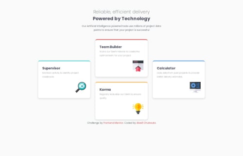
Responsive landing page using CSS Flex

Solution retrospective
I am really proud of how i pushed myself with this project. It was my first time working with CSS Flexbox properties like flex-direction, gap, and learning how to use them effectively made a big difference in my layout. I also explored using multiple media queries to make the site responsive, which was a first for me and something i am excited to build on. Compared to my past projects, this one felt like a much bigger challenge, but it helped me grow and learn much more.
Looking back on how i did, i would focus on writing more efficient and cleaner CSS. i would avoid using fixed widths and heights and rely on more flexible units for responsiveness. I would also like to improve my speed and workflow and being more intentional with layout decisions.
What challenges did you encounter, and how did you overcome them?Firstly, I had issues with the responsiveness of the site. I initially made use of fixed widths and heights which hindered the smooth flow of the site when resizing, thankfully, i got to use multiple media queries at different max widths which made the site run and resize smoothly.
I also had issues with CSS flexbox elements, although it was not too worrisome, i still got ahead of it after continuous trial with new flexbox properties i got to know about and make use of.
What specific areas of your project would you like help with?Definitely, i would need help with the accurate positions of the elements as in the design image.
Also, i would require assistance with the responsiveness of the site to ensure it resizes with ease.
Please log in to post a comment
Log in with GitHubCommunity feedback
- @Afeliciosilva
Muito bom seu código

Join our Discord community
Join thousands of Frontend Mentor community members taking the challenges, sharing resources, helping each other, and chatting about all things front-end!
Join our Discord