Submitted over 3 years agoA solution to the Agency landing page challenge
Responsive Landing Page using CSS Flexbox & Vanilla JS

@Nickil13
Solution retrospective
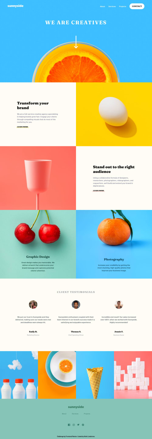
This is the first project I've done where we had to change the colour of images and switch between a desktop and mobile image for different media.
I used filter in my CSS to adjust the colour of the footer logo and menu icon and then the picture tag with source and srcset for keeping the images responsive in the hero and sections.
Are there any better ways of handling these?
Thanks in advance!
Code
Please log in to post a comment
Log in with GitHubCommunity feedback
No feedback yet. Be the first to give feedback on Nicki's solution.
Join our Discord community
Join thousands of Frontend Mentor community members taking the challenges, sharing resources, helping each other, and chatting about all things front-end!
Join our Discord