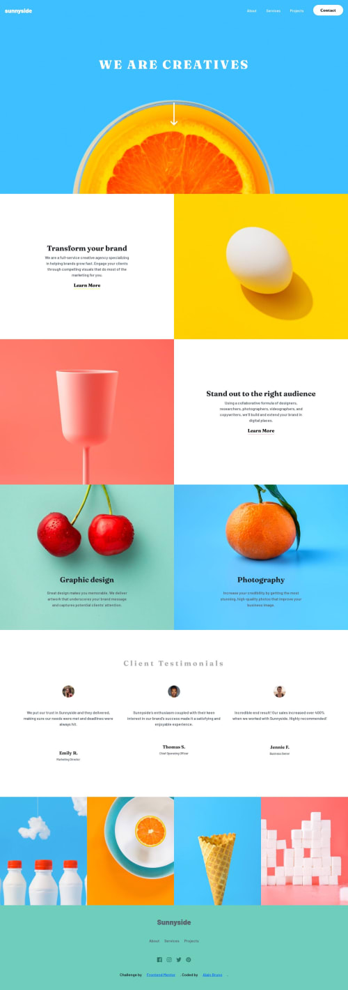
Responsive landing page using css flexbox, grid and bootstrap

Solution retrospective
The challenge was fairly easy to code but styling the hambuger menu was quite difficult.
Please log in to post a comment
Log in with GitHubCommunity feedback
- @JLSoaresRamos
Quick Tip
Semantic HTML
Hello! Here's a quick tip for you: to make your HTML more readable, I recommend using semantic HTML instead of just
<div>
elements. For example, let's look at this code snippet:<div id="head" class="d-flex"> <div id="nav"> <a href="#">sunnyside</a> <div> <ul id="nav-links" class="d-flex"> <li> <a href="#">About</a> </li> <li> <a href="#">Services</a> </li> <li> <a href="#">Projects</a> </li> <button>Contact</button> </ul> </div> </div> </div>
While this code works, for better organization and accessibility, consider structuring it like this:
<header id="head" class="d-flex"> <nav id="nav"> <a href="#">sunnyside</a> <div> <ul id="nav-links" class="d-flex"> <li> <a href="#">About</a> </li> <li> <a href="#">Services</a> </li> <li> <a href="#">Projects</a> </li> <button>Contact</button> </ul> </div> </nav> </header>
As you can see, using semantic HTML makes your code more organized and easier for another developer to understand.
Here's an article about semantic HTML that you can study: W3Schools
Join our Discord community
Join thousands of Frontend Mentor community members taking the challenges, sharing resources, helping each other, and chatting about all things front-end!
Join our Discord