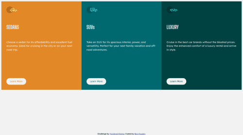
Responsive Landing Page using CSS Grid revised

Solution retrospective
I struggled with using fonts locally for a good part of the exercise. Also, I am unsure why I could not create a border-radius around the cards. Why can't I position the cards wrapped inside a <main> section to the center of the page? And why does the button move and partially cover the paragraph text when the screen gets smaller?
Please log in to post a comment
Log in with GitHubCommunity feedback
- @savvystrider
Hi, I'm glad you didn't give up! I think it came out well.
If you want to apply specific styles when the screen is below a certain size, you'll need to use Media Queries. The syntax takes some getting used to, but it would go something like this:
@media (max-width: 375px) { /* … */ }Quick notes:
- remove
max-width: 85rem;from thebodyelement. It will center the content a little more smoothly. - there's a small typo in your footer styles that's causing some weird formatting:
width: 100dvh;
- remove
- @renikoulen
Hi @savvystrider. I am still working in a solution based in your Feedback. I think I am getting there. Thanks a lot for these helpful hints.
- @savvystrider
Looks good! Try to get the content horizontally and vertically centered on the page. You can use grid or flexbox to achieve this.

Join our Discord community
Join thousands of Frontend Mentor community members taking the challenges, sharing resources, helping each other, and chatting about all things front-end!
Join our Discord