


@OneBitMance
Posted
Hello there Abdullah!
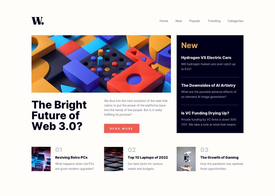
I looked at your solution and I must say that I am pretty amazed! The page is overall responsive, and that side navigation you've got there is really clean!
However, here is what I would tweak on your page:
1. I think that the elements on the page are a bit too large, and could be toned down a bit, but otherwise it doesn't represent any huge problem and if I was a user I would definitely still use your site.
2. The images on the bottom of the page start to look really stretched, until the screen-size goes below 960px and after that it starts to look fine - but then on mobile screen-size ( 375px) they start to look stretched again.
Also, when I increase font size in my Browser settings, the page still looks nice, and I absolutely LOVE that you used rem in your @media query, but there is still that problem with the pictures on the bottom looking stretched.
So I would figure out a way to fix that.
Everything other than that seems absolutely stunning and I must say that you really smashed this project! Keep coding! You are awesome 🧡
Marked as helpful
@Abdul-luh
Posted
@OneBitMance Thank you very much for you kind beautiful words and the correction made. I will put in more effort to get a better job done next time, I'd appreciate it if we could follow each other on GitHub
@OneBitMance
Posted
@Abdul-luh Sure thing my friend, I have followed you back! :)
