Responsive landing page using CSS Grid & Flexbox

Solution retrospective
I'm most proud of making it responsive to different screen sizes since it's my first time using media queries and maintaining consistent CSS class names.
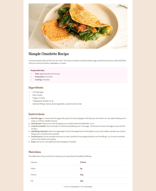
What challenges did you encounter, and how did you overcome them?I encountered a problem where I can't remove the last divider line in the nutrition table I created using CSS grid. The part after the fat nutrition facts at the bottom. And I also couldn't get my ordered list numbers to be the same font as the solution.
What specific areas of your project would you like help with?Removing the last divider line after the fat nutrition facts. Also I changed the font-family for the ordered list in the instructions and used the two fonts that were in the style guide but my numbers still don't look like the numbers in the solution url.
Other than that, just requesting to see if I followed best practices in my code. Thank you.
Please log in to post a comment
Log in with GitHubCommunity feedback
No feedback yet. Be the first to give feedback on Mark Matlock's solution.
Join our Discord community
Join thousands of Frontend Mentor community members taking the challenges, sharing resources, helping each other, and chatting about all things front-end!
Join our Discord